Like many, I’ve been experimenting with Claude recently and tried to explore not only its capabilities, but of course also its limitations. The illusion that I could assign it a task and the AI tool would easily execute the work vanished quickly and I experienced rather the latter. Not only did easy tasks burn a lot of tokens quickly and I hit my limits rather than expected, the results also weren’t that convincing.
So in this post, I will give you some insights into how I utilized the Figma MCP with Claude Code. I experimented with creating a new design system from scratch, starting with a standard Button set.
For the first effort I let Claude create a ShadCN-like documentation project. ShadCN already provides a library of standard UI components so it acted as a great reference for the beginning. I also referenced Tailwind CSS since it features a solid concept for CSS modifiers for variants. I did not want to clutter my system, so I asked for a no install approach. On top of that, I asked to create variables for a tokenized approach. The goal was, that I will have global design tokens in Figma to make the system easily modifiable.
Here’s the prompt:
Assume you're a design systems engineer.

Create a new Folder called "Design system".

Create a comprehensive ShadCN like documentation project, built with tailwind css and ShadCN UI components, use a no install approach.

Use a memory, so you can recall that information later.

The app should feature a persistent left sidebar navigation listing all components and their variants, with each page showcasing examples, states, props, accessibility notes and responsive behavior.

Ensure the layout is clean, production ready and structured for accessibility with clear visual hierarchy and consistent design tokens.

So now for the components. We start with a basic set of buttons in the basic category. Use the image as reference and create variants:

* primary
* secondary
* disabled
* hover

Also add variants for leading and trailing icons.

<!-- Style reference -->
The second screen shot features a full layout view of the final ui as a reference. Extract the color tokens from it.
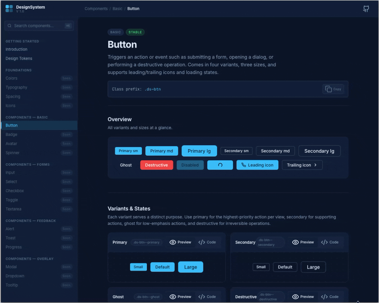
The result of the first prompt, was actually pretty solid. Claude generated a static index.html file with the relevant libraries (Tailwind CSS, Prism JS, Lucide Icons) referenced from a CDN, so I didn’t have to install any additional tools locally.
Sending the components to Figma
As I wasn’t too unhappy with the result, the next step was to send it to Figma already. This was surprisingly easy. I just prompted:
Send the Button Elements to Figma
I’m using Claude Desktop here, so everything I had to do is install the Figma Connector. Claude automatically used the Remote Figma MCP Server to do that.
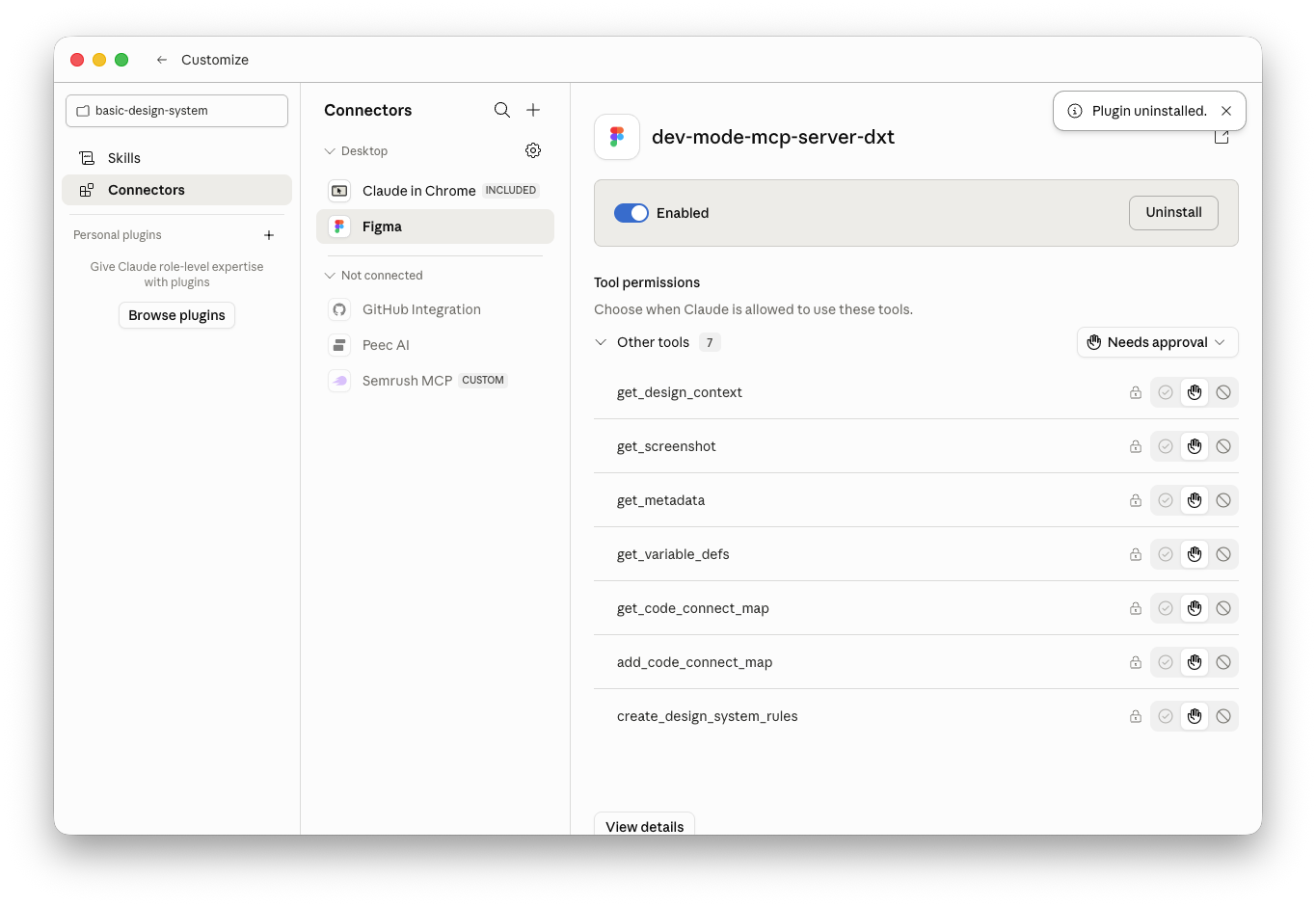
After giving several permissions, Claude started to work on it and it took a while. It created a new file and started adding the buttons. I could watch in real time, how it added element for element. After it was finished I inspected the file and the result was tidy and clean.
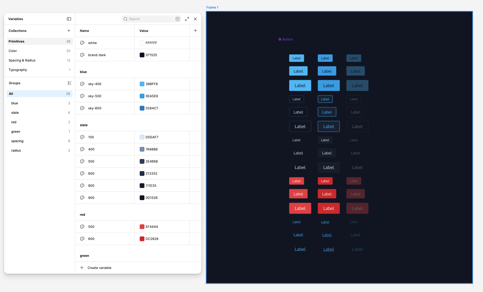
What worked surprisingly well, was the consistent creation of the variables. Claude did a good job, of laying out the color and spacing variables. It created the primitives as a basis and derived the colors and spacing values consistently. And it was also consistently named.
Customizing further
It turned out that I missed mentioning to use the correct font and the border radii in the prompt. So I asked Claude to customize that in hindsight and also create Figma Variables. The variable setup allowed me to customize the values in Figma globally by hand, which was already pretty straightforward. I customized border-radii, paddings and spacings to optimize the button sizes.
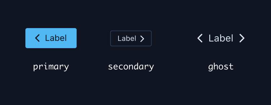
Another thing that was missing, were the trailing and leading icons for the buttons. While it created properties for the component, it didn’t link them to the actual variants. So I asked Claude to catch up on that and it reliably did so.
After that, I recognized that it had just put a rectangle shape as trailing and leading icons.
![]()
So, I also asked to change that as well with the following prompt.
Now replace the trailing and leading icon frames to a text element, so I can use the "FontAwesome Free" Icon Font for the leading and trailing icon. Make sure you don't have excessive frames.
Once that was done, the icons didn’t display correctly. After some examination, I found that it didn’t apply “FontAwesome” as the font for the icons. The Figma Inspector also showed a placeholder icon for the leading icon value.
Takeaways
Be precise
Claude assumes a lot by itself. If you don’t tell him exactly what to do, the result is likely to be something unintended.
Don’t let Claude think, let it execute
Claude is not very good at making decisions on complex aspects, but it can produce output very quickly. It’s important that you are aware of the intent, the human has to do the thinking. Providing a well-thought-out prompt, that contains as much detail as possible will deliver usable results. Just tell Claude what to do and keep it unaware of the intention behind it.
Tokens burn away fast, so be aware of resources
I learned that using the most capable model will burn away tokens pretty fast, hitting the limit wall pretty quickly. Since you have to do the thinking yourself it’s helpful to put the effort into formulating the prompt and think of the details and eventualities. Give well-thought-out instructions that tell it exactly what you would do with the tools you work with. In this scenario I used Sonnet on the medium effort tier for reasonable token take up.
Conclusion
I’m probably not the first one to figure these things out. It took me a lot of experimentation to get to a point, where results were at least acceptable. I’m curious how larger projects will be handled. It’s still a very time-consuming process until proper results are achieved, so I’m currently probably more efficient doing most design work myself.