

When I first tried Claude Design, shortly after it was released, I wasn’t impressed. As an every day Figma user, I missed the option to manipulate elements directly, especially for fine tuning details.
What I overlooked at that point was the fact that it is really good at generating different options efficiently. Most of them aren’t usable, but getting these options suggested helps when exploring and combining different approaches and ideas.
On top of that, being able to quickly test the variations in context helps to explore directions that would take too long to build by hand.
I’d divide my process into roughly these steps:
- Generate many options
- Explore variations
- Refine design
I recently worked on an issue and used this method. The good thing: I could directly create a pull request from it.
The Issue
With one of the first Icinga DB redesigns we introduced a toggle element, that was meant to replace the auto-refresh checkbox input controls. At some point we started to use disabled toggle controls that didn’t have a clear visual representation at that time.
Since we had no use case for a separate read-only style, the disabled toggle also had to show its state
This is what the toggle variants look like in the original version.
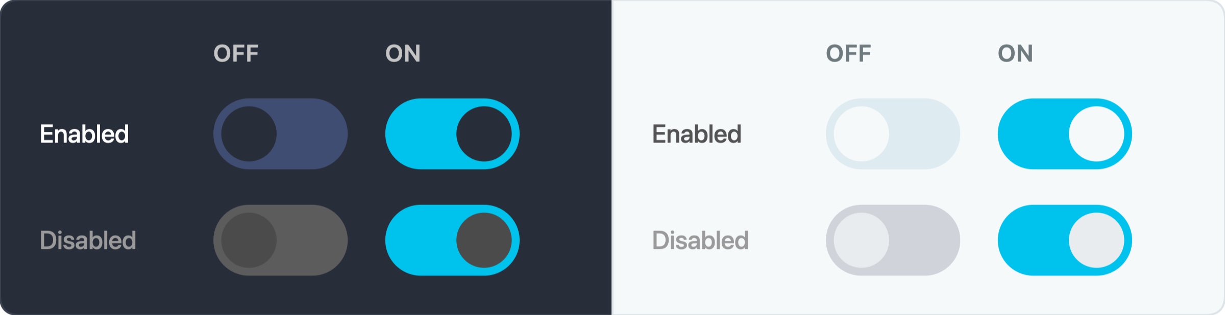
The original version of all four toggle states
The on and off states are pretty well distinguishable in non-disabled toggles. While the off state of the disabled toggle differs recognizably from the non-disabled one, the contrast balance is quite unbalanced. This would make it unintuitive in a form. Especially when there’s only one toggle, its state would not be recognizable. The appearance of the disabled toggle in on state is hardly distinguishable from the non-disabled.
Setup
Let’s talk about the setup first. Using Claude Code instead of Claude Design on its own makes it possible to directly implement what I worked on. It allows me to link to a repository folder later and have all Git functionality available within one chat.
I prefer to work in the Claude Desktop app, but most things should generally apply to Claude Code in the terminal as well. What’s a bit unusual here is that I recommend starting in Claude Code directly.
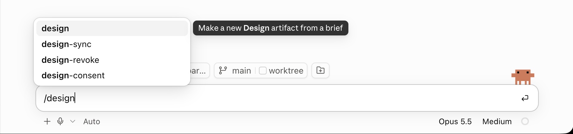
Tell Claude Code to generate Design Artifacts by typing /design
You can create design artifacts right from Claude Code. A Design artifact is the context in which Claude design lays out its designs, similar to a Figma document.

Design mode tells claude that the prompt should result in a Design artifact
This switches into the design context. In this mode you can also assign an existing design system if you have one.
Design Process
Generate Many Options
The first step is to let Claude generate options as a starting point. I usually try to explain what I want to achieve and, if available, provide some context. Context is optional, though; I’ve also got good results by being vaguer. You can also be more casual with the language itself.
When working on bigger projects, I tend to have a Cowork project with all the context stored in different .md files. So I start from there and ask Cowork to generate a prompt for Claude Code. The advantage is that all the relevant project context can be taken into account. In this example the context comes from the GitHub issue.
Here’s the prompt I used for this project.
Look what the toggle element in ipl-web looks like. I want to add a visual representation of the disabled state of the toggle.
Here’s some context summarized in a github issue, but not the complete.
https://github.com/Icinga/icingaweb2/issues/5234The off/on state should be clearly represented in disabled mode as well, while keeping it clear, that they’re disabled. Also regard that gray color values should have a subtile tint of the non disabled color and be derived from @icinga-blue. They should work on both the light and dark @body-bg-color values, since this is the main background color that they’re found in.
Create multiple directions of the disabled and the enabled state appearance for on and off in the current version of ipl web in dark and light mode, so 4 in total for each state and make 5 design suggestions for the disabled states.
The structure of the prompt generally includes the goal, optionally some context or examples and how many variations Claude should generate in the first place
Here is an overview of the results, which you can explore in the artifact. It’s the same kind of overview I’d build in Figma by hand.
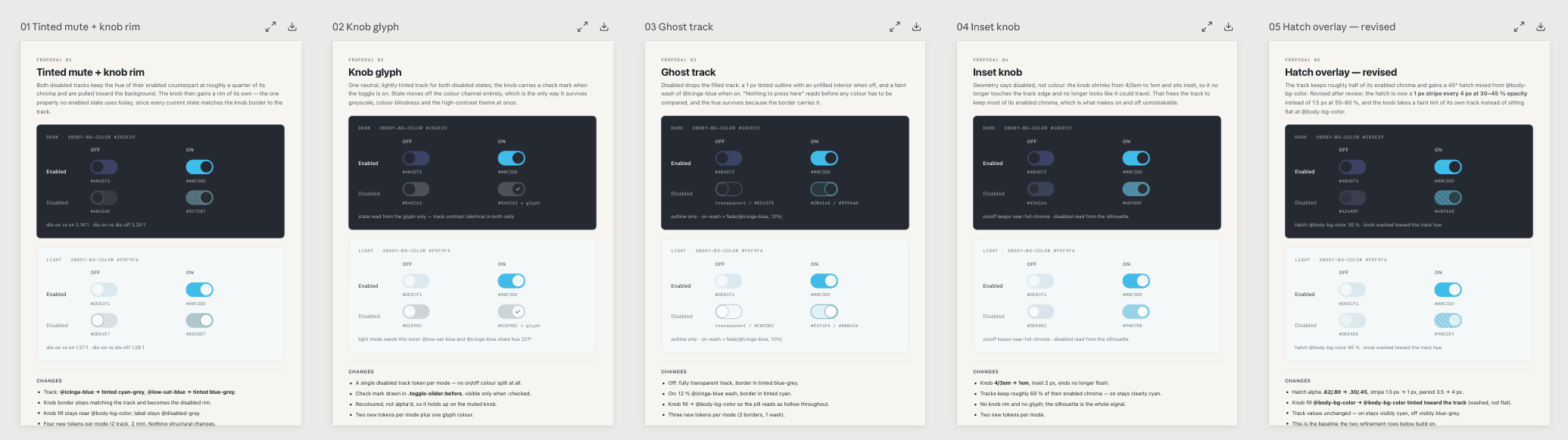
The first prompt resulted in five variations for the whole set
Explore Variations
The first results were a bit random, but I like how Claude also suggests variations that stretch the mind. At first glance, the hatched fill seemed impractical, but I wanted to see whether it could work.
The next step is to pick the variants that point in the intended direction. This brings us to a follow-up prompt.
Ok, I like number 5, but please make sure, that the knob has a little more of a washed out look, while still subtely conserving the color value. Also the hatching bg should be a little more subtile.
Regard the same with solid background.
Make 5 more suggestions each for both directions.
The next step is to refine the suggestions Claude made and let it build on them
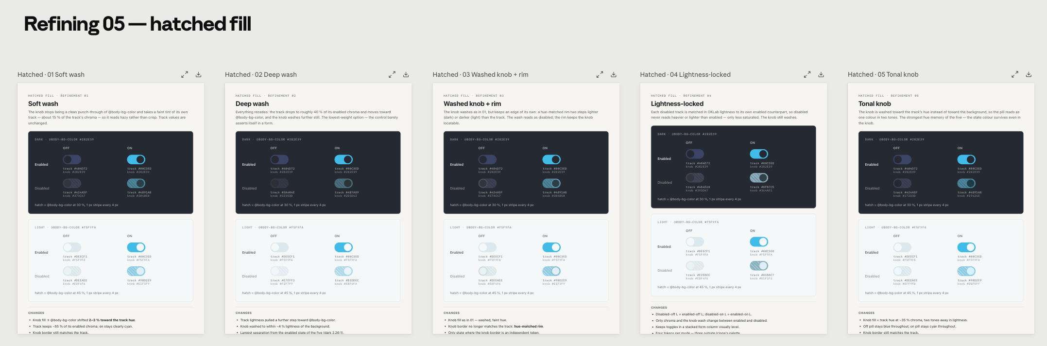
The first refinement was to explore the hatched fill further
I also found the inset knob direction (04 Inset Knob) interesting, so I wrote another follow-up for that one. But instead of using it only for the disabled state, I wanted to use it for the off state of both enabled and disabled toggles.
Another direction i want to explore. Use a shrinked knob for the off state. also 5 suggestions please, based on the results.
A short follow-up prompt is enough to branch off into another direction
The results were variants with different knob sizes.
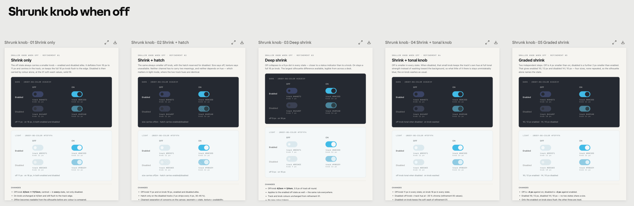
The shrunk knob direction explored different off-knob sizes
Refine Design
To evaluate the directions in a real UI context, I asked Claude to make an interactive prototype. For this, I attached a screenshot of the Icinga DB Web object detail view, which has toggles at the bottom.
I now want to test the variants out in an actual ui. Please take this view as a template
Integrate two controls for the direction and the variant. so i can test the variants side by side.
Attaching a screenshot of a real view gives Claude a template for the prototype
I refined that more and more by asking it to add different controls to the prototype to vary the context. One of them was to add a switch for light and dark mode, so I could see how the color contrast works in both.
After some back-and-forth I worked my way further towards a workable solution. Step by step I ruled out variants that didn’t work.
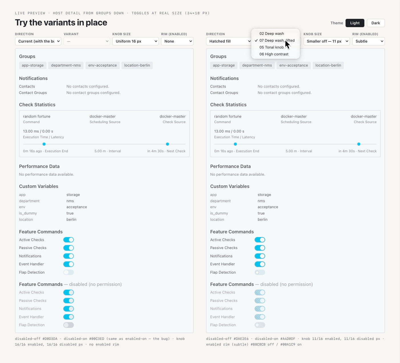
The prototype Claude built to compare the variants side by side helped a lot with refinement. And it took minutes to build.
These were the final variants to pick from. I also let Claude adjust the mockups to render assets for documenting the variants in the GitHub issue.
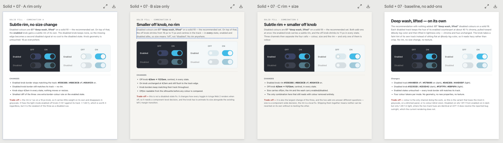
The final set of variations served as documentation assets
In this example project it worked well. Sometimes I still make detail adjustments in Figma during refinement. Either way, having a design system in place helps, especially with Opus, where it produces much more accurate and less random results.
Creating a Pull Request
After tackling the final version and documenting the variants in the GitHub issue, the next step was to build a test implementation and try it out in Icinga Web itself. Since I was already working in Claude Code, it was easy to make a branch in the repository and implement the changes.
See the pull request on GitHub.
Verdict
I’m quite impressed by how Claude Design (in this case via Claude Code) speeds up the UI design process. It enables me to generate and explore multiple directions and create variants almost instantly, something I wouldn’t have taken the time to do by hand.
Seeing variants in context and being able to compare them side by side helps me make faster, better-informed decisions.
Can it automate UI design, then? I’d say it can’t, at least not completely. As you can probably tell from my process, there are still a lot of decisions to make. It generates output fast, but it needs someone to direct it: someone who understands color and contrast, common UI patterns and usability, and who can judge the results in the context of the whole UI system.