
While it might be different within organizations, most demonstrations of Figma features publicly available use case you can see on the Internet are pretty basic.
It makes sense for demonstration purposes, but I’d like to show how I use more complex Auto Layout setups and Component nesting. In fact, I use those features quite extensively to be able to put together mockups quickly.
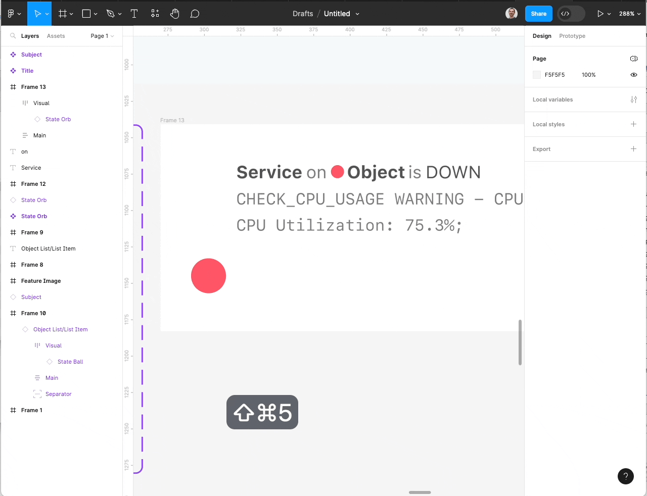
Since we use Lists a lot in Icinga Web, I will again use my favorite demonstration subject: The Icinga DB Web List Item. So let’s get started.
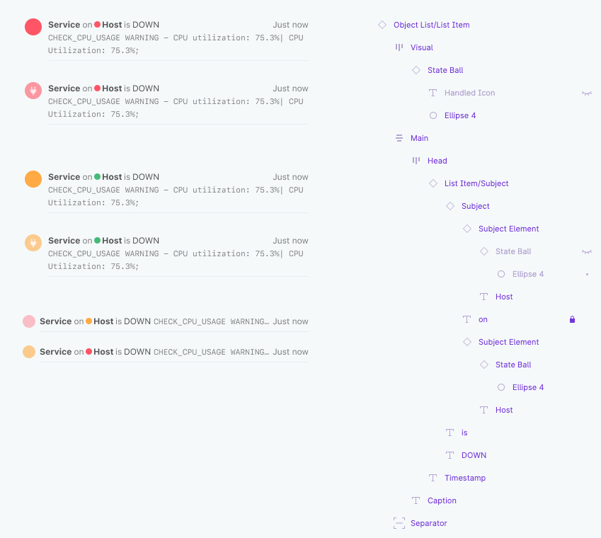
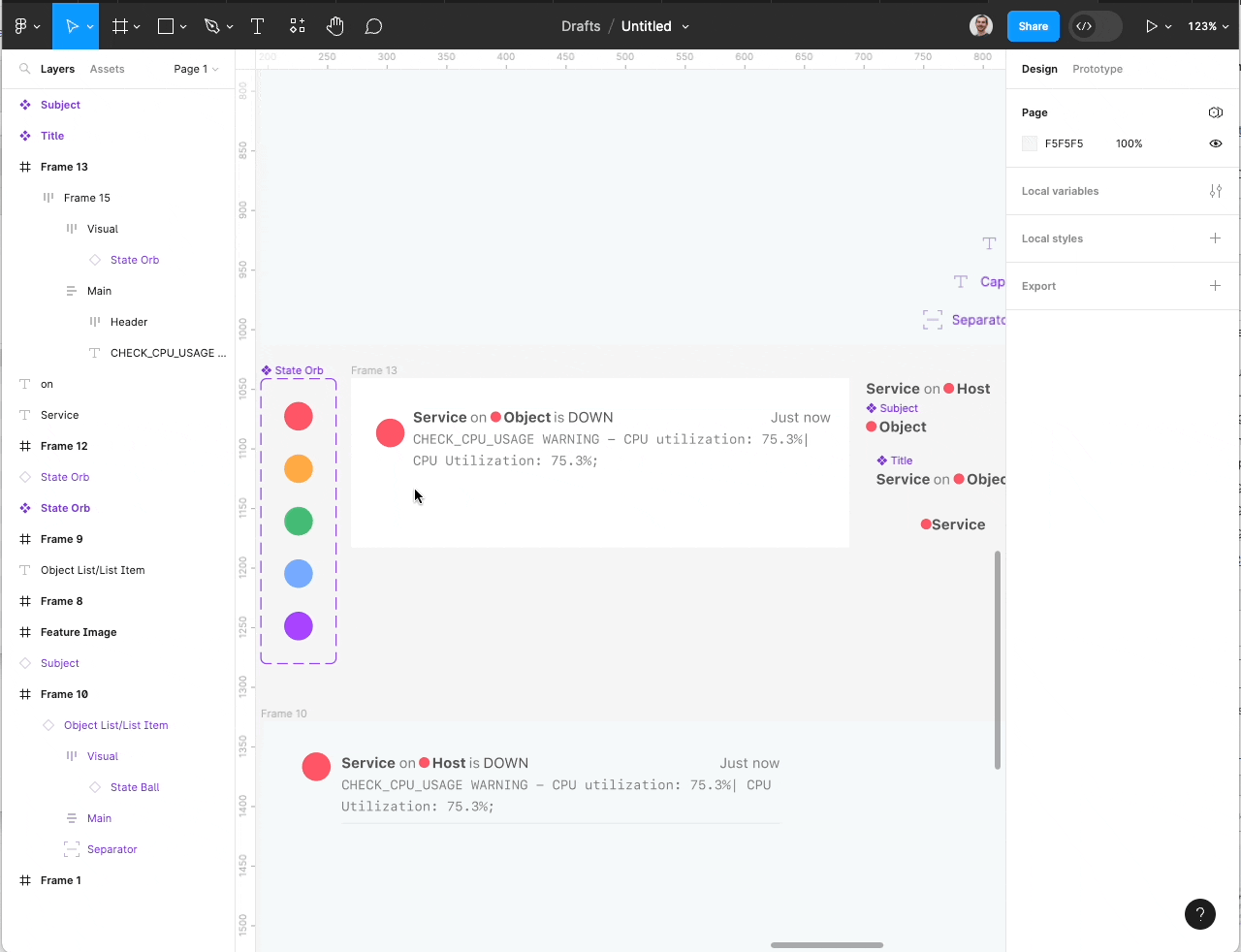
This is an overview of the List Item component in Figma. On the left there are some example with different states. The right shows an expanded layer list of the component.
The Components
I use multiple subcomponents, so let’s start with these.
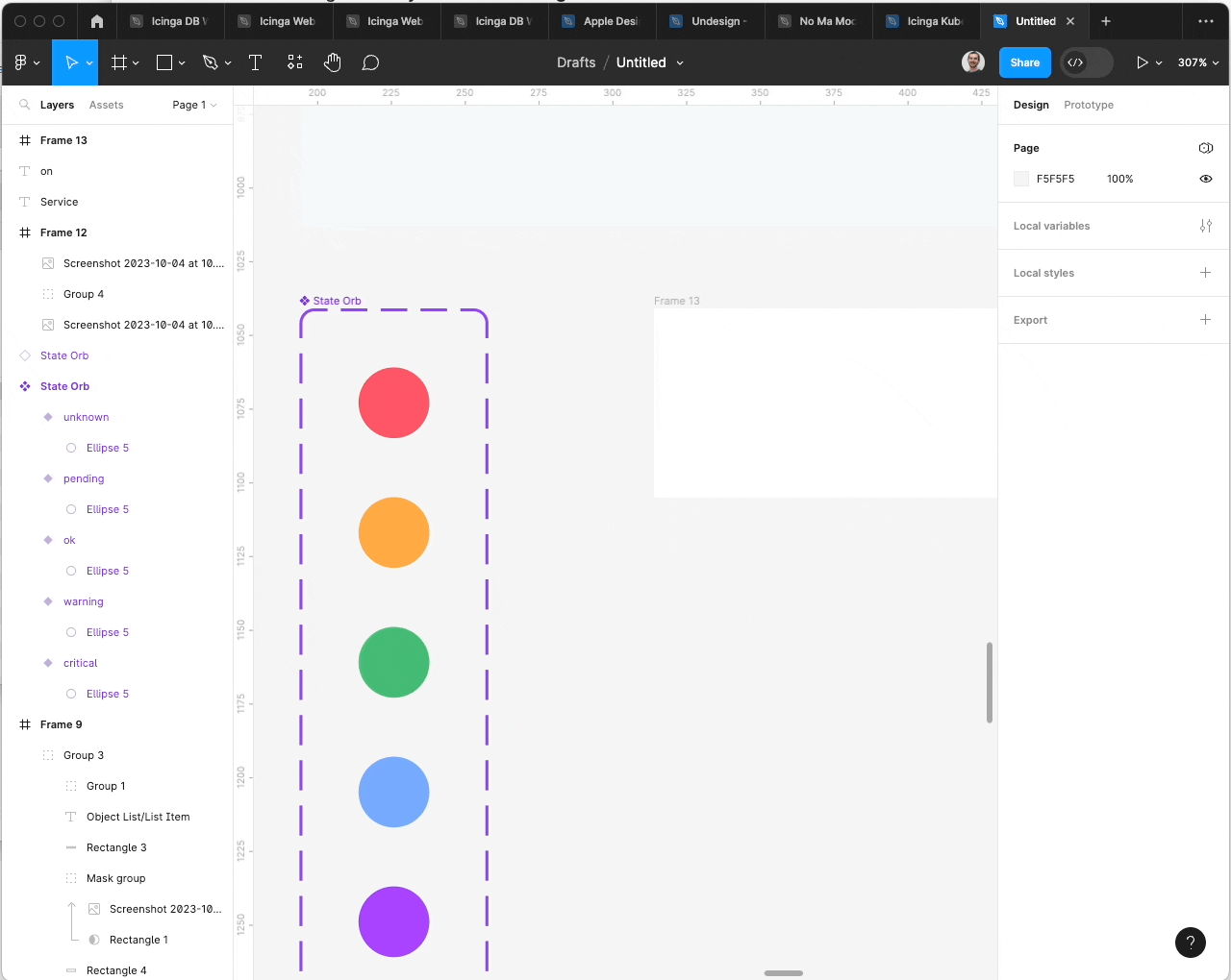
State Orb
For the State Orb I create a circle with the Ellipsis Tool with the dimensions 12 x 12 px. I chose the first one to have the down/critical color. After that we make it a component, name it “State Orb” and create five variants.
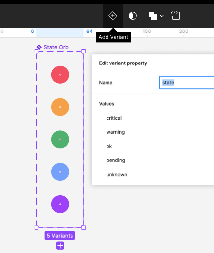
We created a component with variants for the five Icinga object states.
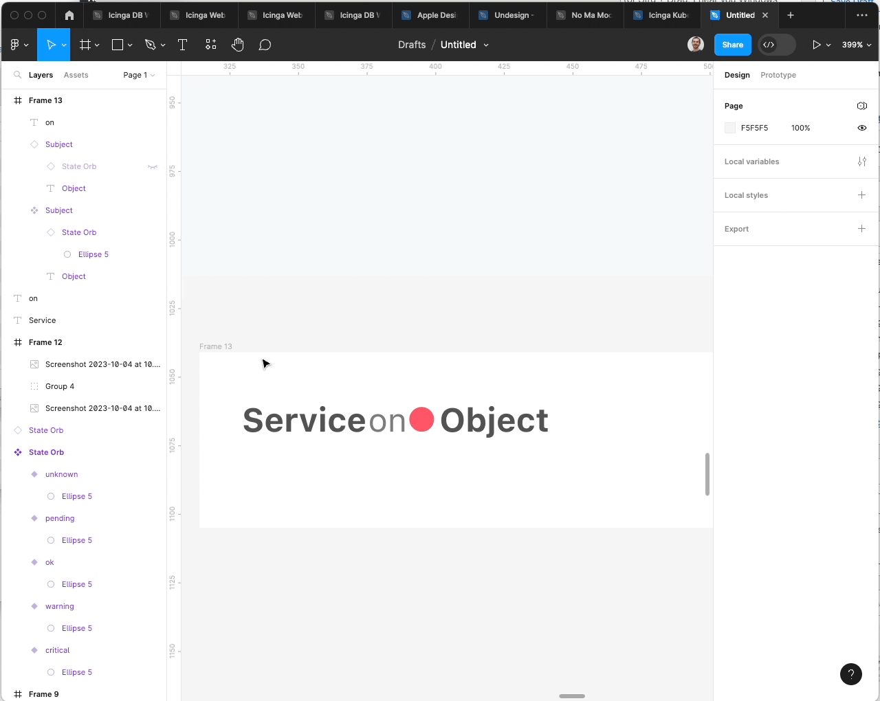
Subject and Header Title
Next, we use one of the State Orb component we just created. Therefore, we use Cmd + Drag (or Strg + Drag, I hear you Windows users) on one of the Orb components.
After that, it’s time to make use of Auto Layout. Add a new Text Layer next to the State Orb. Then Press Shift + A to make it an Auto Layout group. The elements will now align automatically, it’s that easy. Auto Layout works similar to CSS FlexBox. The default layout is horizontal, but this can be changed, as I’m going to show you later.
For the correct spacing, set the horizontal gap to 2px. I usually use this to emulate a space in the regular font size.
We create a new Component from our newly made Auto Layout object and rename the layer to “Subject”. Next, we make a copy of this to use the component and duplicate it one more time to have another one. Within one of the “Subject” elements we delete the State Orb and set the text to “Service”.
Next, we add two more text layers to finish the List Item Title. We align them next to each other and again press Cmd + A to add Auto layout, set the gap to 2 px and enable the “Align text baseline” option. We create a new component of this and call it “Title”.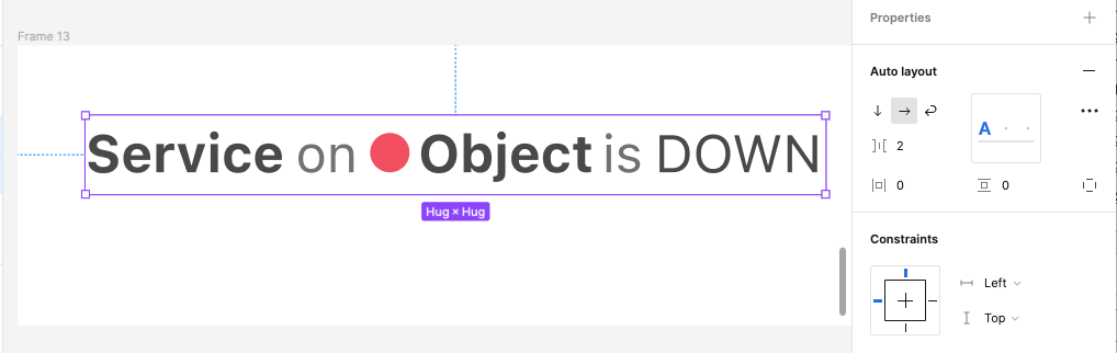
Finish the List Item Header
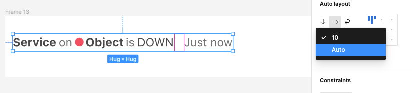
For the timestamp element, we add another text layer and set the text to a generic Date/Time. I use “Just now” in this example. Another time of selecting the created timestamp and the title object and press Shift + A to add Auto Layout. Enable baseline alignment.
This time we won’t set the gap to 2px, but select “Auto” from the dropdown. Resizing the newly created Auto Layout group, you’ll notice that now the timestamp element will stick to the right.
Create and add a Caption Element
To add the caption element, we create a new Text layer and set the text to a generic Plugin Output. We add the corresponding styling in a Monospaced Font. I use “SF Mono”. To make the text break, I scale the object down horizontally to match the width of the header element.
Since the caption text should be truncated when containing more than two lines, I set the height of the caption layer to two times the line height of the text.
But since the height input is disabled, I have to enable the appropriate Resizing option first. I set it to “Fixed size”. For the exceeding text to be truncated, I also enable the “Truncate Text” Option.
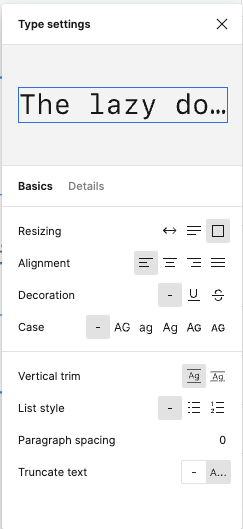
Setting the type settings to have the text truncated, when exceeding the container
I can now align the Caption and the Title element properly and make it another Auto Layout group with Shift + A. Figma is so smart to set the layout direction to “vertical”. You can now try to resize the newly created group, and you should notice that the elements won’t scale correctly.
To fix this, we set the horizontal resizing options for the title and the caption layer to “Fill”. This way, the layers will automatically fill the available space horizontally.
Before we continue, we rename the newly created Auto Layout group “Main”, since this will make the main section of our list item.
Add the Visual
The last missing piece for Auto Layout glory is the visual. Since we already prepared the State Orb, this seems to be easily done. There are some caveats, though, so follow me step by step.
Let’s start by adding a new State Orb object. To do this, we copy and paste one of the variants of our State Orb component and align it properly with our recently created “Main” layer group.
First, we select the State Orb and wrap out in a new Auto Layout group. In this case another Shift + A will achieve this. This group will be named “Visual” then. This time, we set the Auto Layout alignment setting to “top center”.
Next align the “Visual” layer properly with the “Main” element. The top borders should align and the height should match. Another Shift + A with both elements selected will enable Auto Layout once more.
When resizing we see that again, there are some issues. The “Main” element’s width won’t adapt correctly. So again, we select this layer and select “Fill” from the resizing options. After that, the basic layout should now be properly and adapt to changing screen sizes.
Auto Layout
Auto Layout is a really powerful feature in Figma and lets you create versatile components. Since it works almost exactly like CSS Flex Box, it’s easy to create components that behave exactly like web components would.