In the field of data visualization, Chart.js is a popular JavaScript library used to make flexible and good-looking charts. It’s simple and versatile, making it a great choice for many uses, including monitoring systems.
This library ensures that charts display well on all devices and screen sizes, its responsive design guarantees optimal visual presentation everywhere, which is crucial for monitoring dashboards accessed on different devices.
What is Chart.js?
Chart.js is an open-source JavaScript library for the creation of various types of charts. Despite its lightweight nature, Chart.js is robust, supporting a wide range of chart types, including line, bar, radar, pie, doughnut, polar area, bubble, and scatter plots. It is highly customizable and functions well with responsive web designs, rendering it an optimal choice for contemporary web applications.
Who’s interested in this?
Chart.js is ideal for developers and designers who need a simple yet powerful library to create responsive, interactive, and customizable charts on web applications. Its straightforward API and comprehensive documentation make it suitable for both beginners and experienced users looking to quickly integrate a variety of chart types into their projects.
Doughnut-Chart as Example
To illustrate the visualization of a chart in addition to mere description, the following example presents a simple doughnut chart.
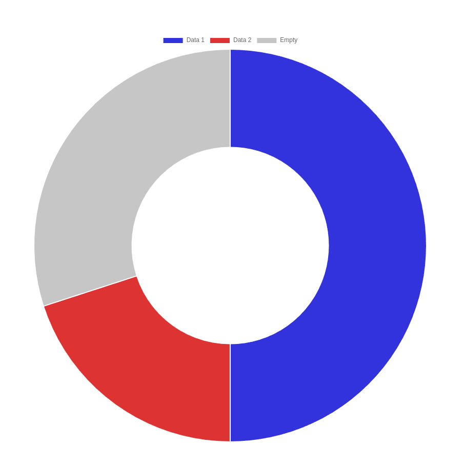
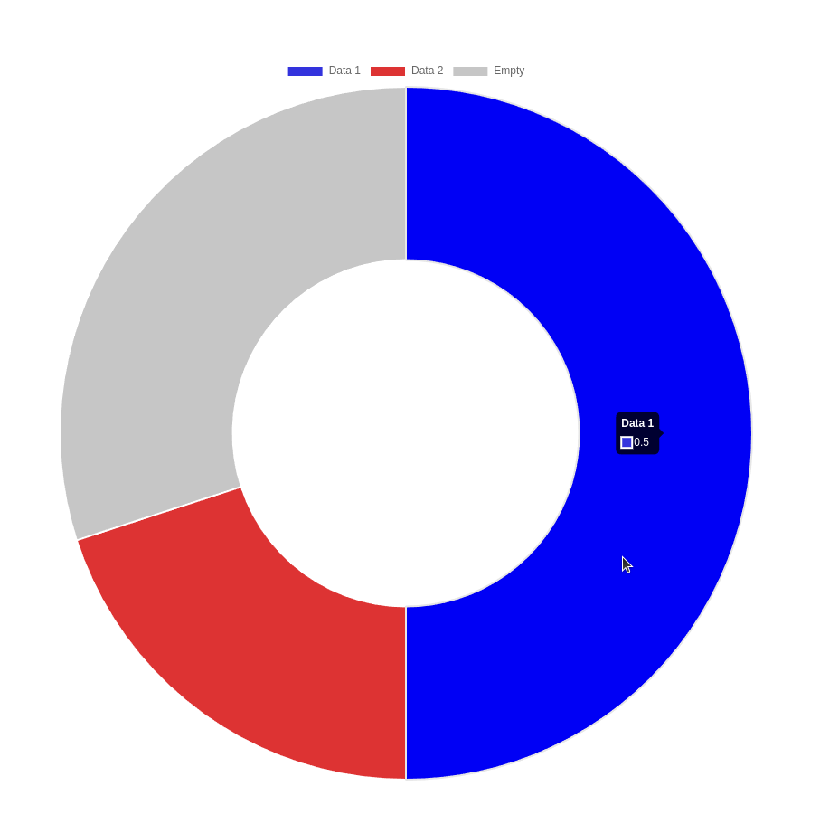
Initially, it is necessary to create an HTML <canvas> element in which the chart will reside. The only requisite is an ID to assign the configuration; all other attributes may also be set via JavaScript.
In the context of our application, the HTML element is generated by PHP, which allows for the values to be set dynamically. In this example, the values are set statically for the sake of clarity.
  <canvas
    id="myChart"
    data-1="0.5"
    data-2="0.2"
    complete-circle="1"
  ></canvas>
The process was relatively straightforward, but this is a JavaScript framework, which is where the majority of the functionality resides. Consequently, it is necessary to select a method for installing the framework. For the purposes of testing, I would recommend utilising the cdn import method.
<script src="https://cdn.jsdelivr.net/npm/chart.js"></script>
In order to generate a new chart, it is necessary to provide an HTML <canvas> element and a configuration object, which is created in JavaScript.
const chart = document.getElementById("myChart");

const data1 = chart.getAttribute("data-1");
const data2 = chart.getAttribute("data-2");
const completeCircle = chart.getAttribute("complete-circle");

const emptySegment = completeCircle - data1 - data2;

const config = {
  type: "doughnut",
  data: {
    labels: ["Data1", "Data2", "Empty"],
    datasets: [
      {
        data: [data1, data2, emptySegment],
        backgroundColor: ["#33d", "#d33", "#aaaa"],
      },
    ],
  },
};

new Chart(chart, config);
By default, the charts have a hover effect, which highlights the section or point in question and displays the value and the label (if applicable).
Customized Doughnut-Graph
To illustrate a more complex example, consider the following chart, which depicts a usage value and a separate scale representing a limit. The limit indicates the point at which the usage reaches a critical state.
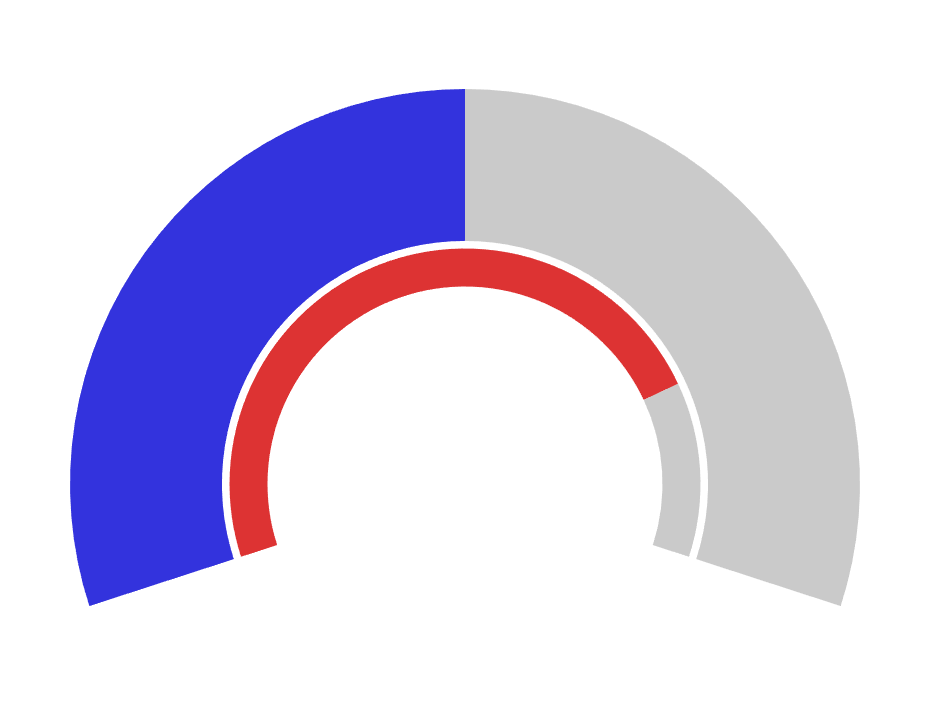
The HTML portion remains as simple as in the preceding example.
<canvas
  id="myChart"
  data-limit="0.8"
  data-real="0.5"
></canvas>

<script src="https://cdn.jsdelivr.net/npm/chart.js"></script>
The configuration is somewhat more intricate.
- In order to display the two graphs and the spacing between them, it is necessary to create three datasets.
- The unclosed circle is generated by making a segment invisible and then rotating the graph to move the starting point.
- In the “options” of the config, besides adding the rotation, we also disable the hover-effect.
const chart = document.getElementById("myChart");
const limit = chart.getAttribute("data-limit");
const real = chart.getAttribute("data-real");

const colorEmpty = "#0000";
const colorGrey = "#aaaaaa9f";

const emptySegment = 2/3;
const completeCircle = 1 + emptySegment;
const rotation = ((1 / completeCircle) / 2) * 360;


const data = {
  datasets: [
    {
      backgroundColor: [colorEmpty, "#33d", colorGrey],
      data: [emptySegment, real, 1 - real],
      weight: 20,
    },
    {
      backgroundColor: [colorEmpty],
      data: [1],
      weight: 1,
    },
    {
      backgroundColor: [colorEmpty, "#d33", colorGrey],
      data: [emptySegment, limit, 1 - limit],
      weight: 5,
    },
  ],
};

data.datasets.forEach(element => {
  element.borderWidth = 0;
});

const config = {
  type: "doughnut",
  data: data,
  options: {
    plugins: {
      tooltip: {
        enabled: false,
      },
    },
    hover: {
      mode: null,
    },
    rotation: rotation,
  },
};

new Chart(
  chart,
  config
);
Customization
The degree of customization available is considerable. The framework offers a plethora of customization options for colors, fonts, tooltips, and animations, thereby enabling developers to tailor charts to specific needs and preferences.
Conclusion
Chart.js is a great tool for creating dynamic and interactive charts, making it perfect for monitoring applications. It’s easy to use, customizable, and performs well, which is why it’s ideal for visualizing real-time data, building custom dashboards, and analyzing past trends. Using Chart.js helps organizations improve their monitoring systems, offering clearer insights and faster decision-making.