
Being a Sketch user since it’s early days, I found Figma looked really promising, when it finally appeared. While Sketch caught up on most of Figma’s features, like collaboration, developer handoff and AutoLayout (at least to some degree), the small feature set nuances as a whole made Figma attractive to at least have a deeper look at. Especially component variants seemed really powerful at first sight.
So I finally gave Figma a try and was curious to which degree I could replace Sketch for my daily design work flow.
Components
One of the central aspects of using Sketch was a central UI component library, so I can quickly put together UI Mockups. That actually works pretty well in Sketch. By the way: in Sketch they are called “Symbols”, but they work basically the same.
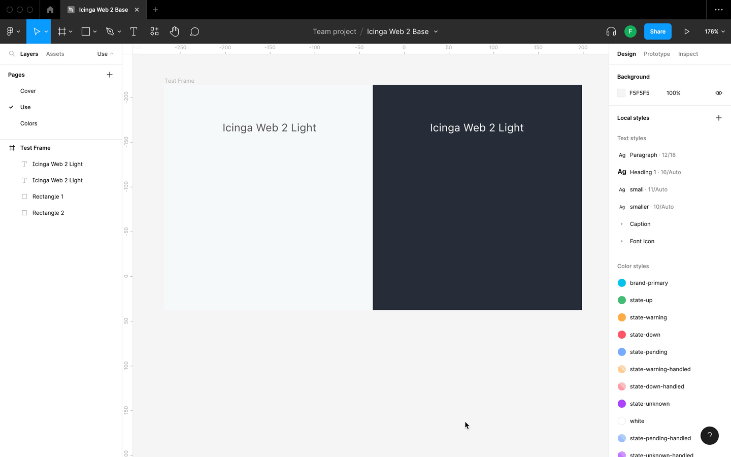
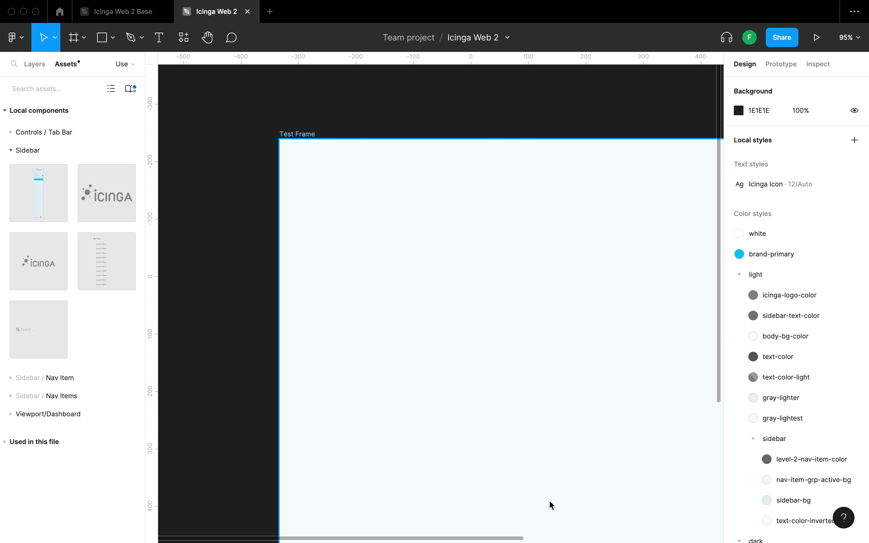
I re-built a basic component library for Icinga Web 2 to get started. I started with the atom elements and made components for buttons, different input types, text styles and went on to more complex components for list controls.
Component Variants
Variants in Figma were one of the most promising features, that Sketch completely lacks. It would make it easier to manage different states of elements. It was also better for including separate styles for each component in light and dark mode and make it easier to use switch between the too themes with just a toggle of a button.
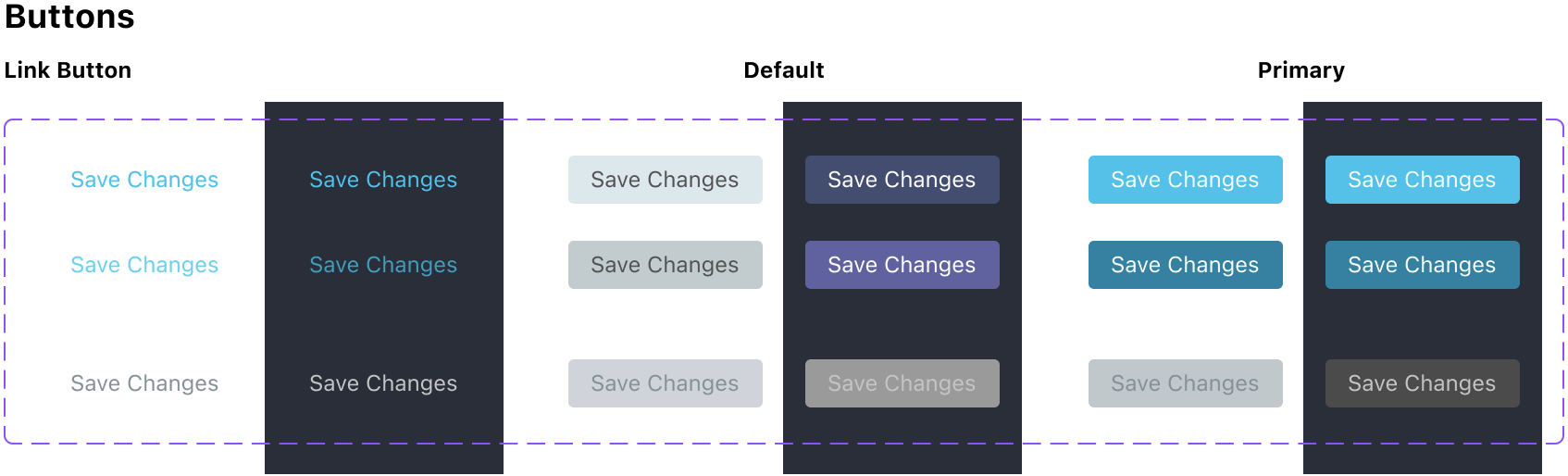
There are different variants for buttons:
- Link Button
- Default Button
- Primary Button
Every style of button has a three states:
- default
- disabled
- hovered
While creating these variants isn’t very magical (you still have to create each variant manually), it makes using them and switching between them so much easier, especially when there a multiple parameters.
Using component variants is super efficient. When creating mockups for a new module, it’s easy to set up the main frame for Icinga Web and customise it for exactly what I need.

Setting up variants for a component
Here’s how easy it is to set up a component with variants.
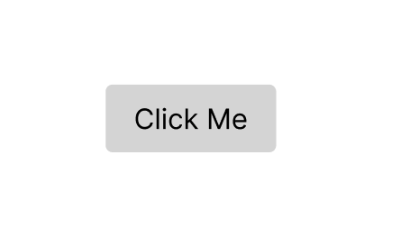
So let’s create a Button, with a label.

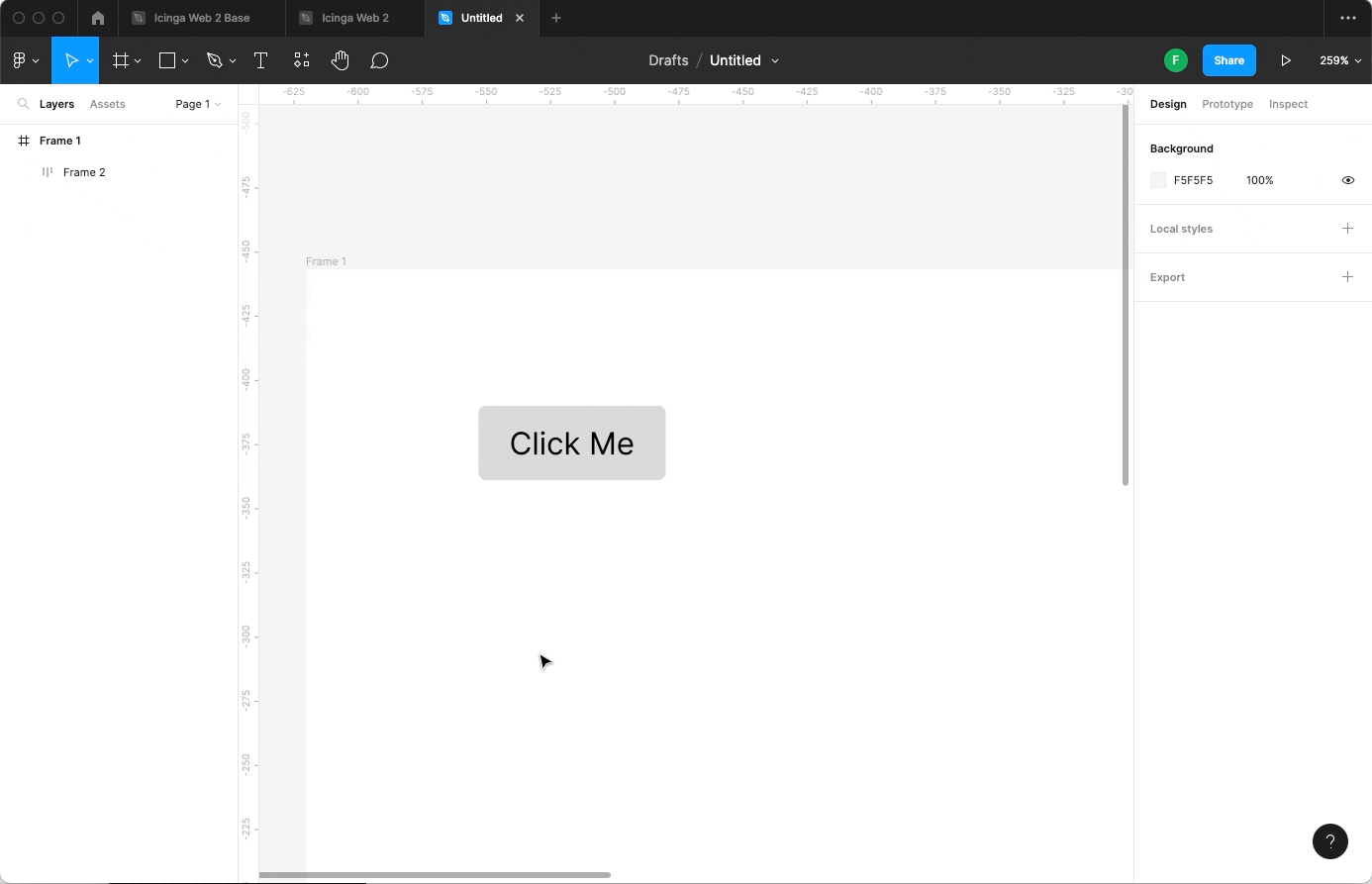
Select it and click create component in the Tool Bar, to – you guessed it – create a component from it.
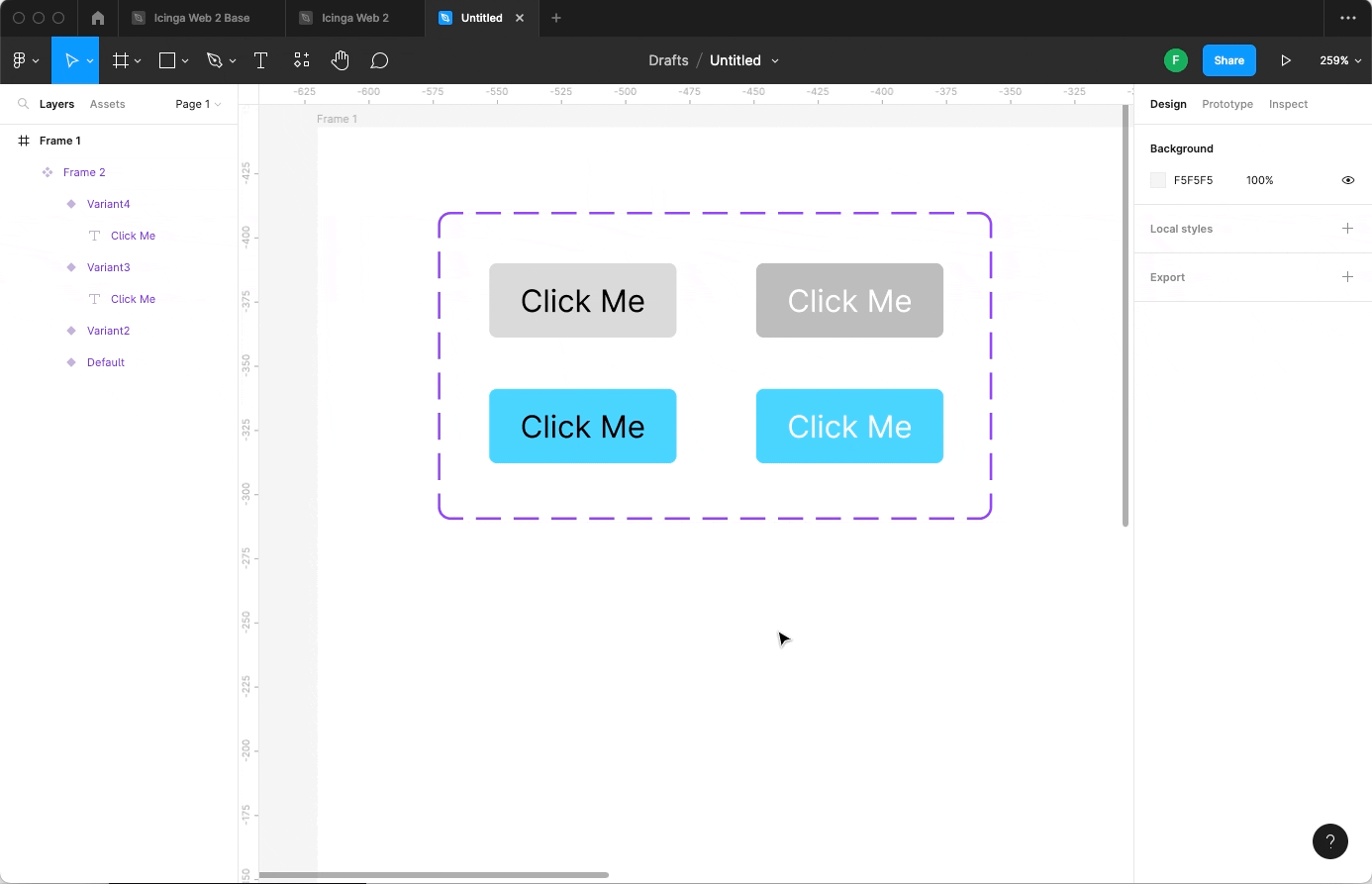
Now, let’s create four variants for the Button, with the “type” property. We name two of them Primary and two of them Default.
After that let’s add a second property. The quickest way is to select the first two variants of them and press Cmd + R (I’m with you Windows users, it’s Ctrl + R on your OS) to rename the variant. You can add property value pairs by comma-separating them.

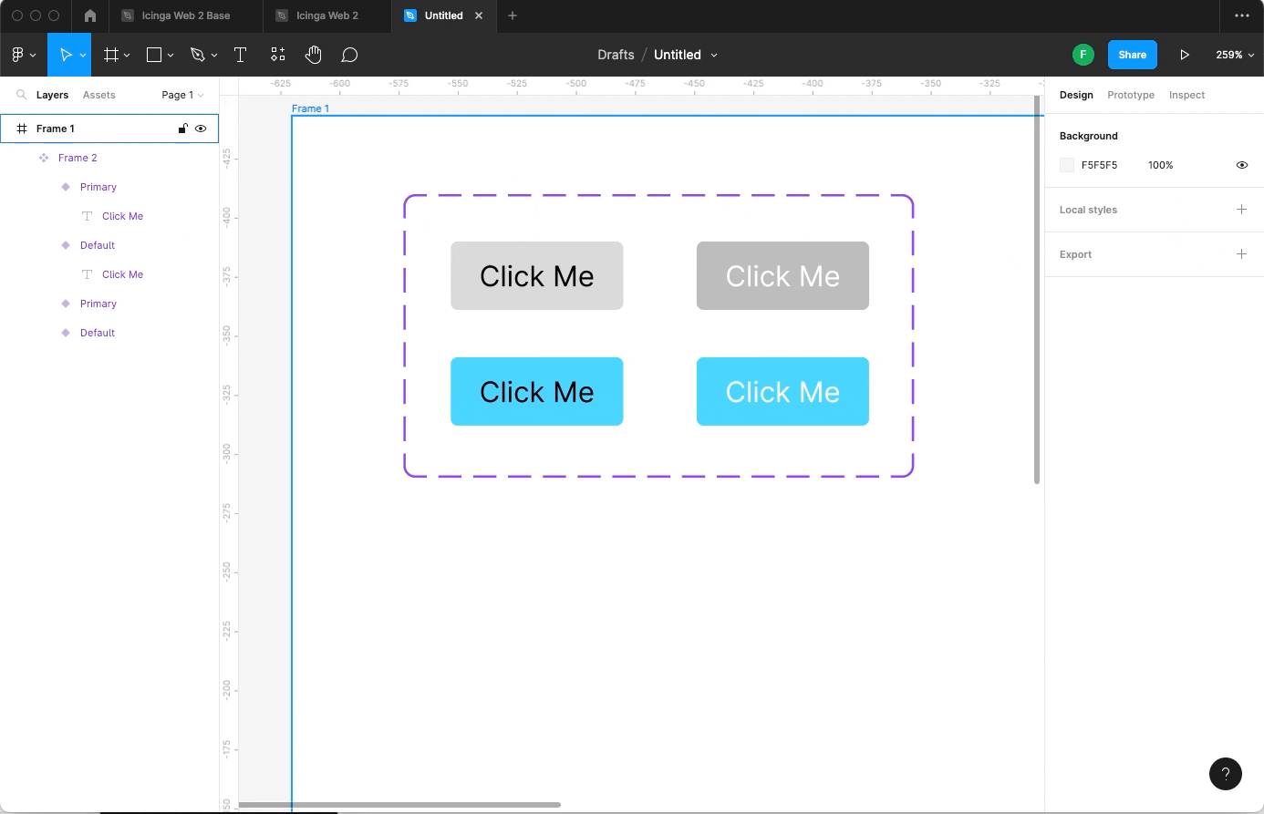
Now our button component is ready to use. You can add as many properties as you like.
It is not ready quite yet, but you can look forward to the finished Icinga UI component library that you can browse and use for your modules in the future.
Subscribe to our newsletter and follow us on social media, so you don’t miss it!