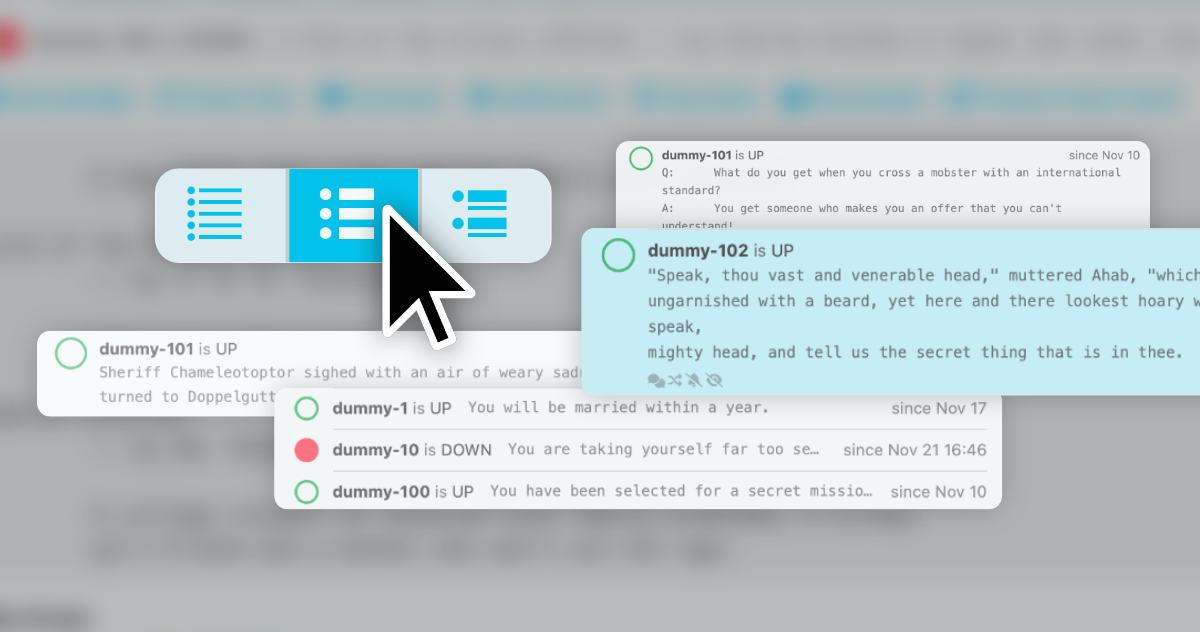
With Icinga DB Web you can now customise Icinga Web’s list views to your needs.
While in one scenario you might be more interested to see as many objects as possible at a glance, in another scenario detail attributes of only a few objects will be more important to you. Yet, in the first case, you would even be distracted by more detailed information. We considered exactly that, when redesigning list views for Icinga Web, so we implemented a control to adjust the grade of detail for object list views.
Adding a new control
The newly added view mode switcher control lives in between the already known controls and provides three view mode options to you. The view mode will be persistent for every list type (precisely for every controller), so you will always find your preferred list view mode, when you navigate back to them. You will find the view mode switcher in host and service lists, but also for comments and downtimes.
It’s also possible to control your view mode by the url parameter view, which can be set to minimal, detailed or common. This makes it possible to set the view mode, when displaying your lists in, e.g. dashlets.
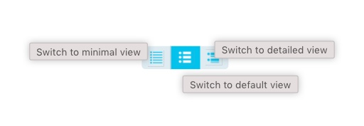
The view mode switcher lives between your controls and offers three options for displaying lists
Default View
The default view should be the most common view mode and has a good balance between displayed items and detail information. The list item height is evenly spaced and shows a maximum of 2 lines of plugin output. The status symbol serves as the main visual for the list item making it an eye catcher and so the first element to spot for every item. There’s also the timestamp of the last state change. No less, no more.
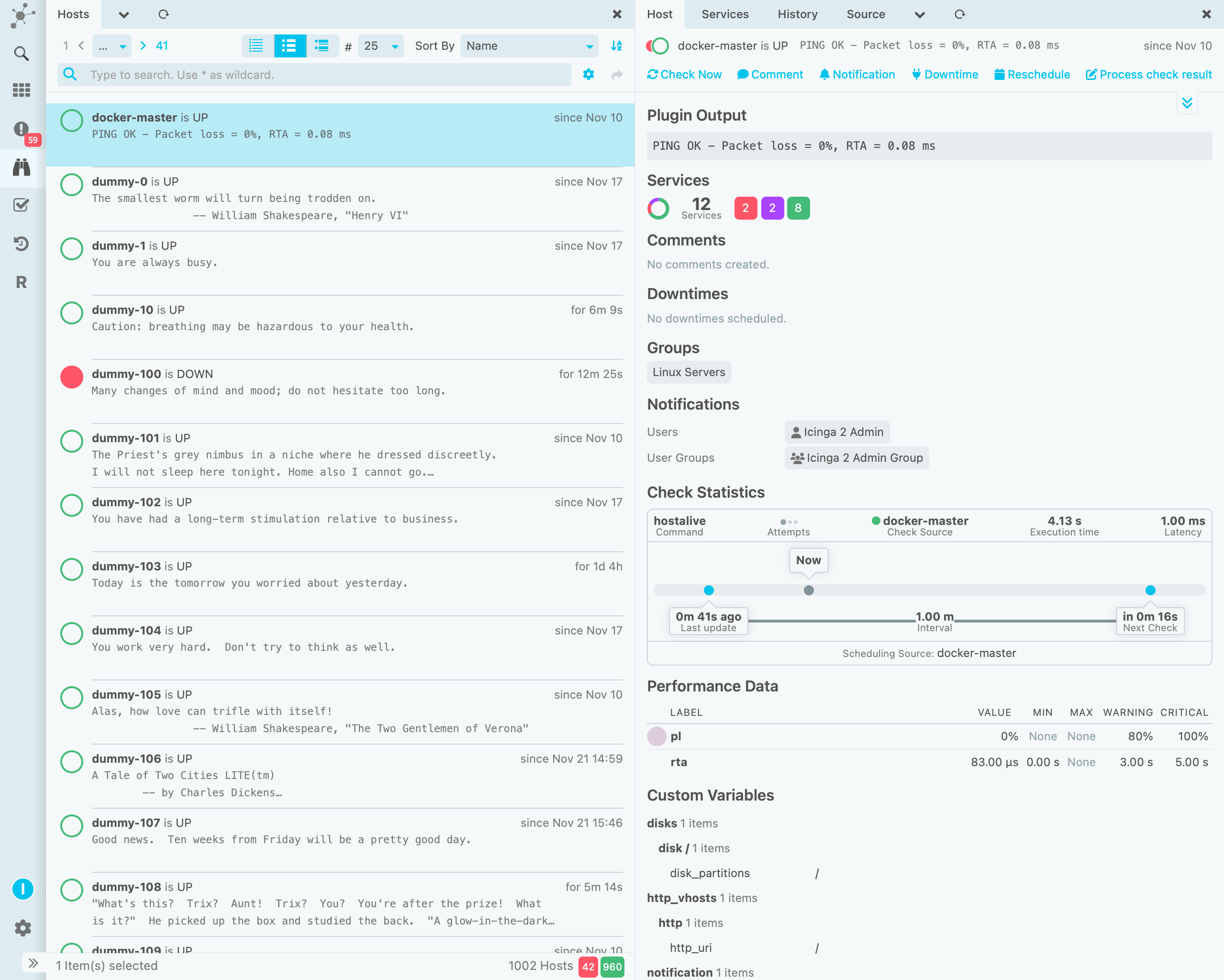
The default view mode display a balanced amount of information density and detail.
Minimal View
For demands of high information density the minimal view is the most suitable. Showing only an ellipsisized portion of the plugin output the minimal list items are designed for maximum space efficiency. Naturally the status visual is the most prominent element, to spot problematic items in the list at first glance. Increase the number of items display in the list for the maximum amount of list items to fill your screen.
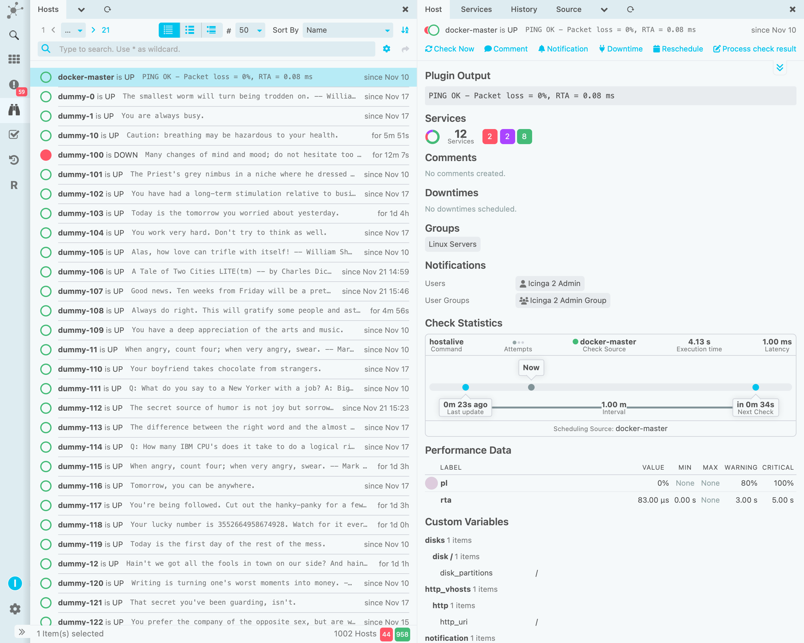
Designed for screen real estate efficiency the minimal list view mode is designed to fit a maximum number of list items onto the screen.
Detailed View
There are also use cases, where it’s important to spot detail information in the plugin output of the objects. As its name suggests it is the most detailed one and designed for displaying the most plugin output in lists. A maximum of five lines of is displayed in this view mode. Additionally to that, we also added a footer, which holds additional status items, when available.
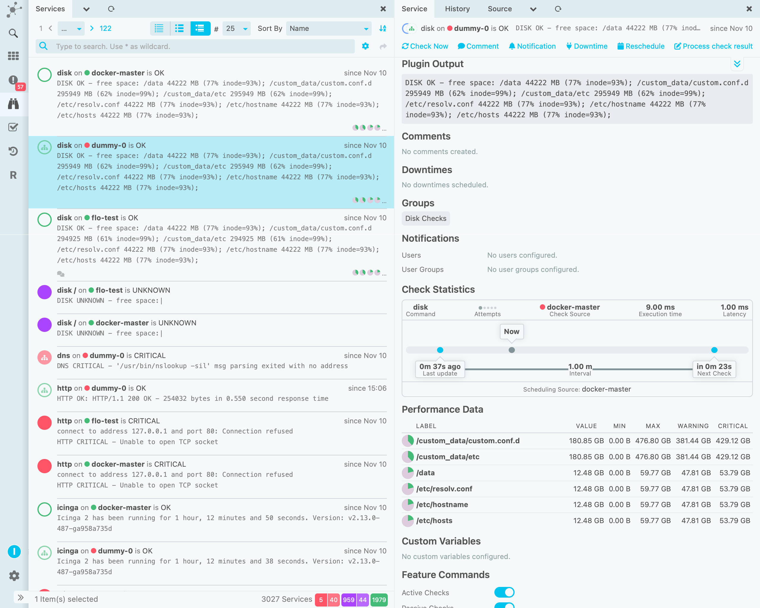
The detailed view state is meant to show more detailed plugin output and additional status information.
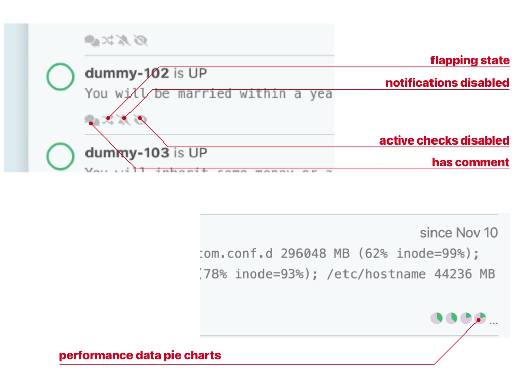
A footer appears when there’s additional status information, on the right side performance data pie charts can be found.
Conclusion
The view mode switcher is only one of the great new features in Icinga DB Web. We think that it enhances the usability for list views a lot and will soon introduce more new features in detail.

