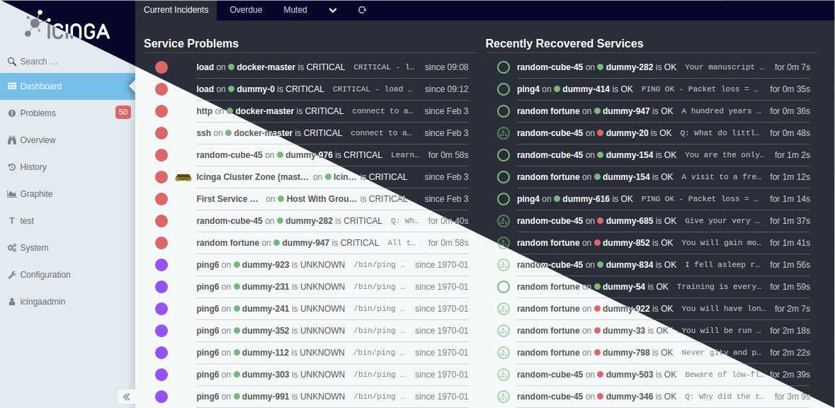
Most of you know that Icinga Web can be adjusted by themes. Some of you also have made some! Icinga Web itself comes with several themes since the early days.
Now with the next upcoming major update v2.10 we’ll take themes to their next evolution. But since we’ve postponed this feature, much additional work has gone into it, which I want to outline today. There will be some general hints for module/theme development as well.
Preparations
This applies to both themes and modules. With v2.10 a major change will take place: The dark mode is the new default. While previously the default theme had a mostly light appearance, this may mean additional work for custom themes and modules in order to avoid any contrast and appearance issues.
What I’m talking about here, is the distinction between background and foreground colors for example. There is Icinga Web 2’s @body-bg-color variable, which is a background color. If your theme or module uses this to define a background-color the risk for issues is very low. On the other hand, if it’s in use for text color it will most certainly mean you will encounter contrast issues. The same applies of course to the use of Icinga Web 2’s @text-color variable for background-color.
While we’ve worked on exactly this for the businessprocess, cube, jira, reporting and x509 modules, we’ve also had to fix numerous cases where there weren’t any of the available LESS variables used to define colors. Only the usage of LESS variables allows the switch between light and dark. So if you have cases of background-color: white;, define it with the variable @body-bg-color and you’re good to go.
Notable changes
But there’s more, and I cannot outline all cases here. Instead, I prepared what I think are the most problematic changes to variables that may lead to contrast and appearance issues. So if you’re using any of these, check their usage explicitly in dark and light mode to see if there are any issues.
Strong Contrast Changes
Gray colors were changed, but @gray-lighter and @gray-lightest show the strongest difference since they were nearly white previously and are now nearly black.
@low-sat-blue and @low-sat-blue-dark are still blue-ish in appearance, but while it previously was more of a light-blue it is now a dark-blue.
And then there’s @body-bg-color of course. This went from white to the grey-ish color you see in the image above.
Inverted Colors
@gray and @gray-light got basically interchanged.
@text-color, @text-color-inverted, @text-color-on-icinga-blue and @link-color got exactly inverted.
Changed Colors
@tr-active-color and @tr-hover-color were light-blue-near-white and now have a darker more medium-blue.
Establishing Dark and Light Mode Support
For modules which do not use custom LESS variables and use Icinga Web 2’s variables properly, this section is not required. They will work with dark and light mode out of the box. Themes on the other hand will have to be adjusted in any case as described below.
Since the dark mode is the default in Icinga Web, this also applies to themes and modules. Though, for themes this default mode is not necessarily dark. So if a theme does not really need a light mode, it’s not mandatory to add one. The mode option will just not be available for such a theme.
If you want to provide light CSS rules in your module or theme however, you’ll need to provide either of these detached rulesets:
Modules
@light-mode: {
  --your-custom-color-variable: blue;
};
Themes
@light-mode: {
  :root {
    --body-bg-color: lime;
  }

  .icingaweb2-module.module-foo {
    --your-custom-color-variable: purple;
  }
};
This is also one of the big changes made since the release of v2.9.0. It is not necessary to provide a full blown media query, this detached ruleset (which can be defined multiple times in multiple places) is all that is needed to provide light mode support.
Technical Background
You may wonder what these two dashes in front of the definitions mean. These are CSS variables and are referenced by the use of the CSS var() function. Though, the latter is done automatically by Icinga Web 2. Any occurrence of a LESS variable usage that defines a color is automatically replaced by this instruction: var(--body-bg-color, @body-bg-color)
The @light-mode rulesets are collectively placed inside a media query by Icinga Web 2 as well. Based on the examples from above, this generally looks like this:
@media (prefers-color-scheme: light) {
  // That's from the module
  .icingaweb2-module.module-foo { // This is added automatically since it originates from a module
    --your-custom-color-variable: blue;
  }

  // That's from the theme
  :root {
    --body-bg-color: lime;
  }

  .icingaweb2-module.module-foo {
    --your-custom-color-variable: purple;
  }
}
What I’ve just described as automatic, was a manual task up until we’ve decided to postpone this feature to v2.10. You’re welcome. 😀
Conclusion
If your module only references Icinga Web 2’s LESS variables and you use them correctly, the chances are very high that you don’t need to worry about compatibility with v2.10. If you have custom LESS variables to define colors, adjust them to match the default dark mode of Icinga Web and provide light CSS rules.
If your theme overrides Icinga Web 2’s LESS variables extensively, the chances are also very high that you don’t need to worry about compatibility with v2.10 either. Only in the case your theme mades just a few adjustments or you want to provide light mode support, you’ll have to invest some time to ensure compatiblity.
–
I hope you’ve found this useful. If you have questions, head over the forums and ask for assistance.


