User Interface design or product design in general is less about tools than it is to have a proper understanding about the product you work on. And besides understanding, how the user is going to use your product, recognizing patterns and underlying relationships between key elements is crucial.
Besides that, there are some tools, that really enable me to iterate quickly on ideas and concepts and then communicate these to the team. So I thought some of you might be interested in the tools I use in my daily work.
The first one, I want to start with is Sketch, a graphics tool that’s focussed on UI Design, which some of you might probably heard of.
Sketch has been my main app for doing mockups and quick drafts. I started doing UI design work at a time, when most of these things were done in Photoshop, just because there were no proper alternatives at the time. Then after I learned about Sketch, I immediately got hooked. The workflows were really smooth, stripped down and really focussed on what you need for UI Design.
Quick mockups and drafts
I have basically two different workflows. The first one is to just do quick mockups and try to visualize quick ideas or smaller changes to views in Icinga Web. Therefore I usually start with a screenshot of the current view in the Browser.
Then I adjust the according parts and overlay them with mocked up elements. This is where sketch comes especially handy, because a lot of the workflows are drag and drop based.
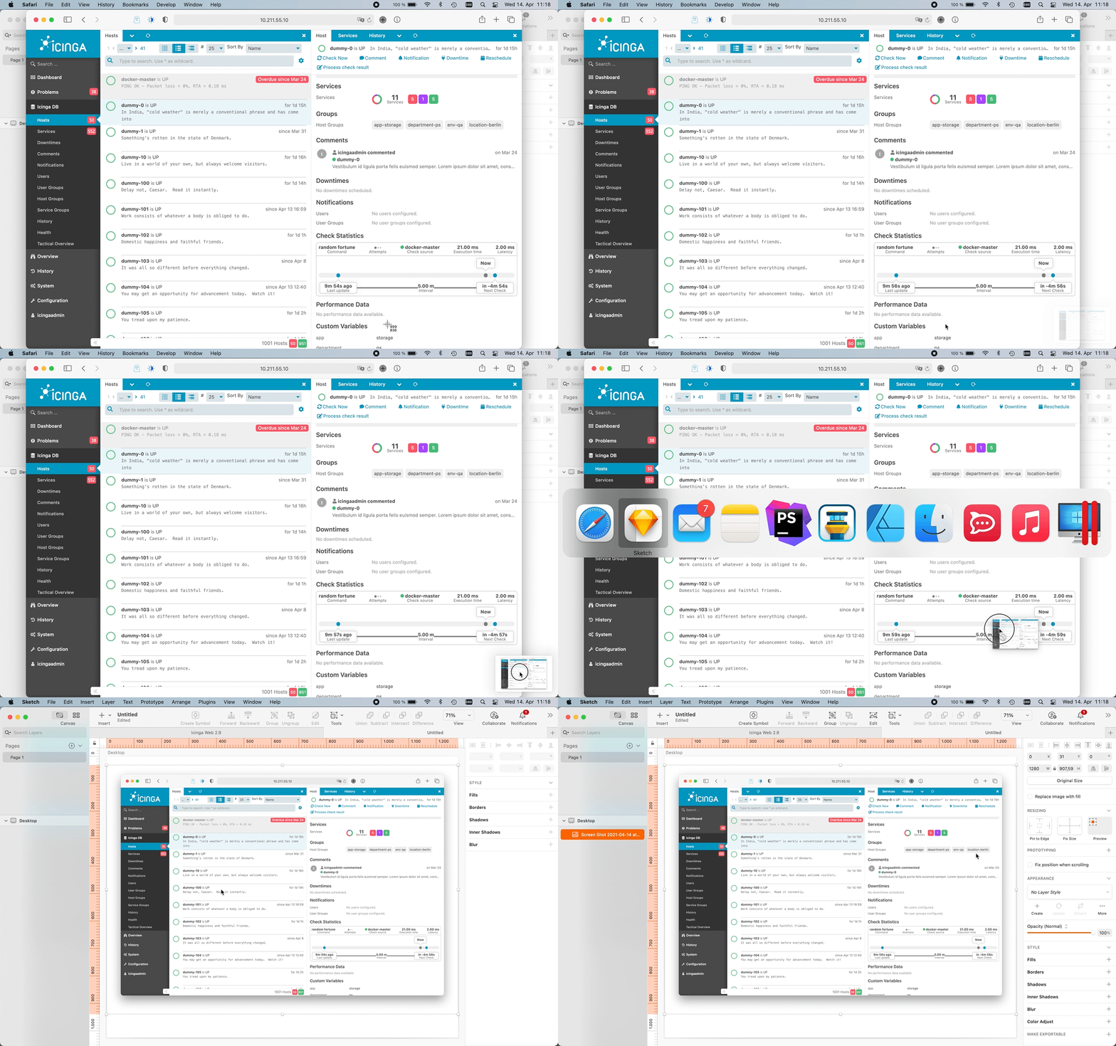
Dragging and dropping screenshots into Sketch is a breeze
Designing from Sket…, ehm… Scratch
Then there’s the more wholistic workflow, where I conceptualize deeper redesigns. This was for instance the case, when we worked out a new design system for the Icinga DB Web UI.
In this case I usually have to work out multiple versions of different UI parts over a greater span of time and ideate a lot. Then after presenting and discussing the drafts with development, I work on different iterations.
This is where the Sketch’s symbol feature is an integral part. Otherwise it wouldn’t be possible to keep track all the changes and different versions of the single components and more importantly having them synced across several dozens of view mockups.
There’s also a Sketch component library, that I created for the Icinga Web UI over the time. This enables me to put together complete view mockups from scratch in no time.
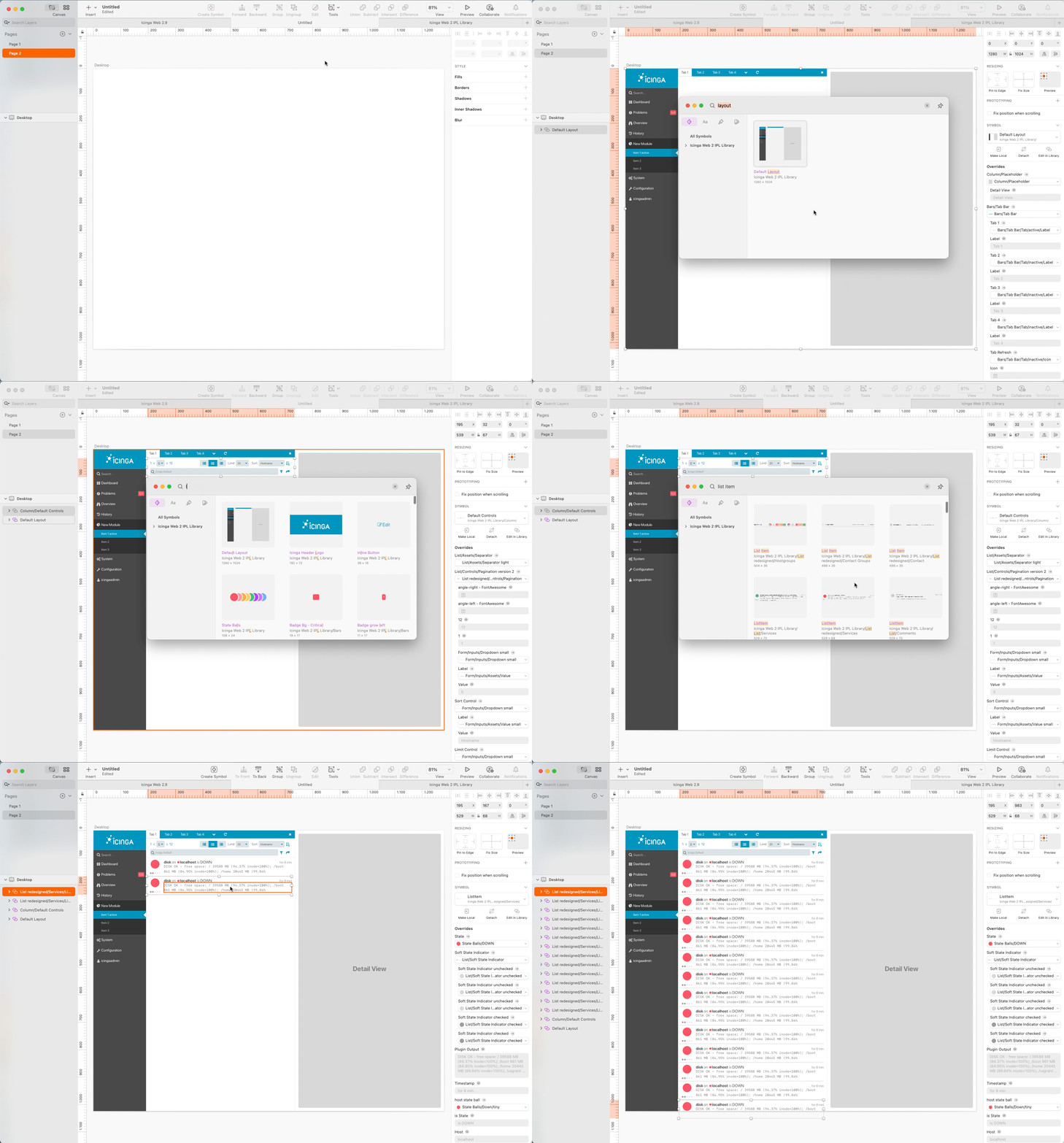
Putting together UI mockups with the Symbol Library, created for Icinga Web 2
Other features
I sometimes use the Sketch’s Data feature, where I can quickly fill components with Icinga related dummy data. I created a custom data set for server names, host names, which can then be randomly inserted into symbols.
Of course there’s the color library, that contains all the preset colors of our project.
From time to time I make use of the sadly only very basic prototyping feature to visualize click paths throughout an app mockup.
Summary
When it comes to ideating, it’s all about being quick and immediate. In the end Sketch is mostly a communication tool for me, which allows me to formulate and visualize ideas and concepts very efficiently.
Other tools like Figma have started pioneering some features, that Sketch has to play catch up in some way. And the fact, that it’s Mac only isn’t pretty helpful, when working in a heterogenous OS environment.

