Designing user interfaces for Icinga Web is always a bit of a balancing act. Once we’ve worked through all the technical and conceptual details of a new feature, it can be tough to step back and see things from a fresh user’s point of view. We as developers know too much — and that makes it hard to guess how others will understand what we’ve built.
We do full usability evaluation before releasing new modules, but we’ve found that quick user tests in the middle of development can really help us make smarter decisions – especially when it comes to more subtile design details.
In this note, I’d like to share an example of how a short usability test helped us make a more informed decision about a custom UI element in our dependency views module.
The Challenge
We had just built a proof of concept for visualizing an object’s direct dependencies, and while the core feature worked well, we anticipated user struggling with the interpretation of the summary element, especially misinterpreting the given numbers of total objects.
In high-pressure scenarios – where every second counts in identifying and resolving monitoring issue, even small usability issues can have a real impact on users. So we wanted the visualization to be instantly understandable.
We explored alternative designs for the summary section, but building them would require the development of custom UI components. Before committing to that effort, we wanted to validate whether these design changes would actually improve understanding.
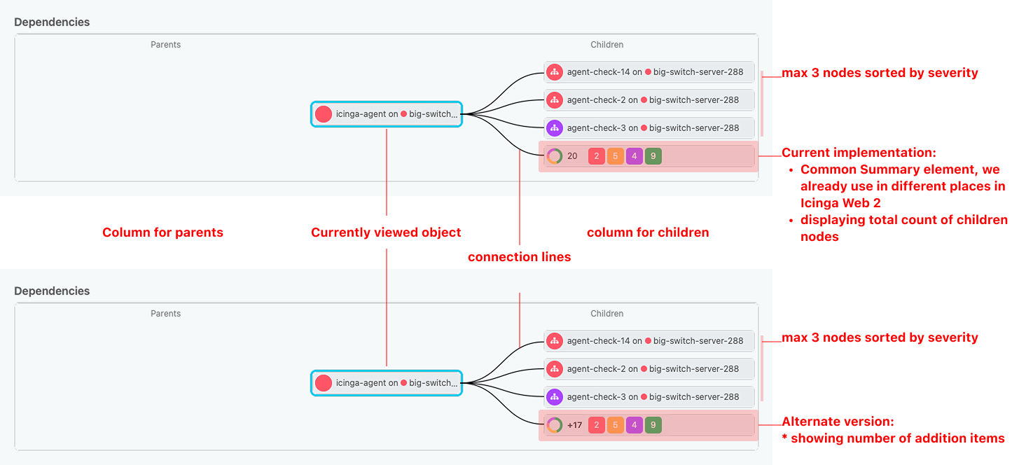
Current vs. alternate design
Test Goals
- Determine whether users intuitively understand the current design.
- Evaluate whether the alternative design improves comprehension.
- Assess whether it’s worth the effort to develop a custom design component.
Preparing the test outline and protocol
Whiteboarding tools provided a simple yet effective way to organize our process and brainstorm ideas – from outlining the test flow to capturing responses and spontaneous remarks from participants.
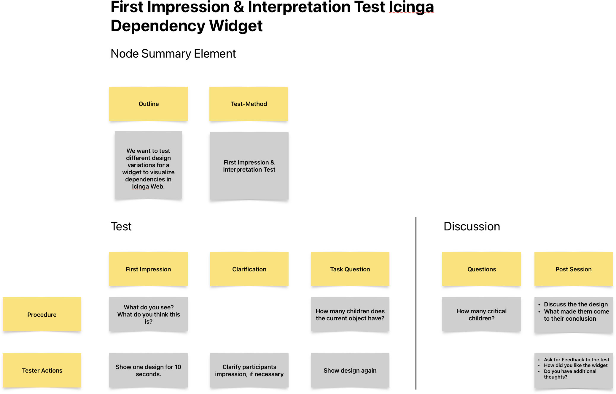
Test Outline
Each session had its own section within the note, allowing us to keep track of individual insights while maintaining a clear overview. The ability to sync across devices also proved useful, enabling us to update notes in real time, whether we were at a desk or conducting a remote session.
Preparing the User Test
To validate our assumptions, we ran a small test with people from our network based on the 5 second test method. Here’s what the process looked like:
Test User Criteria
- Participants, who have an understanding with server infrastructure, monitoring, and object dependencies
- We reached out to spontaneously available users to keep the process agile.
- 10 Participants, i.e. 5 for each design variation
Test Flow
- Introduction: We explained the purpose of the test and what participants could expect.
- First Impression:
- Show the mockup with one variation of the design
- Question: “What do you see?”
- “What do you think this element does?”
- if necessary, we clarified the assumption, so every user was on the same page
- Interpretation
- Show the mockup again
- Task Question: We asked them, how many total children objects the current object they would think they has and rated their confidence (1–5)
- Discussion: We interviewed the participants about their thoughts and how they came to their decisions.
Key Findings
- Although the sample size (5 users per variation) was small, the patterns were clear:
- The current design was frequently misinterpreted.
- Users better understood the alternative version that showed a (+) symbol before the total count and counted only the additional node elements.
- The issue turned out to be the styling of the summary element – when it had the same design as the single node elements including a connection line, users assumed it to be an additional object, not a summary.
- The donut graph also confused users. It was visually appealing, but most couldn’t grasp its meaning, and it didn’t add much value.
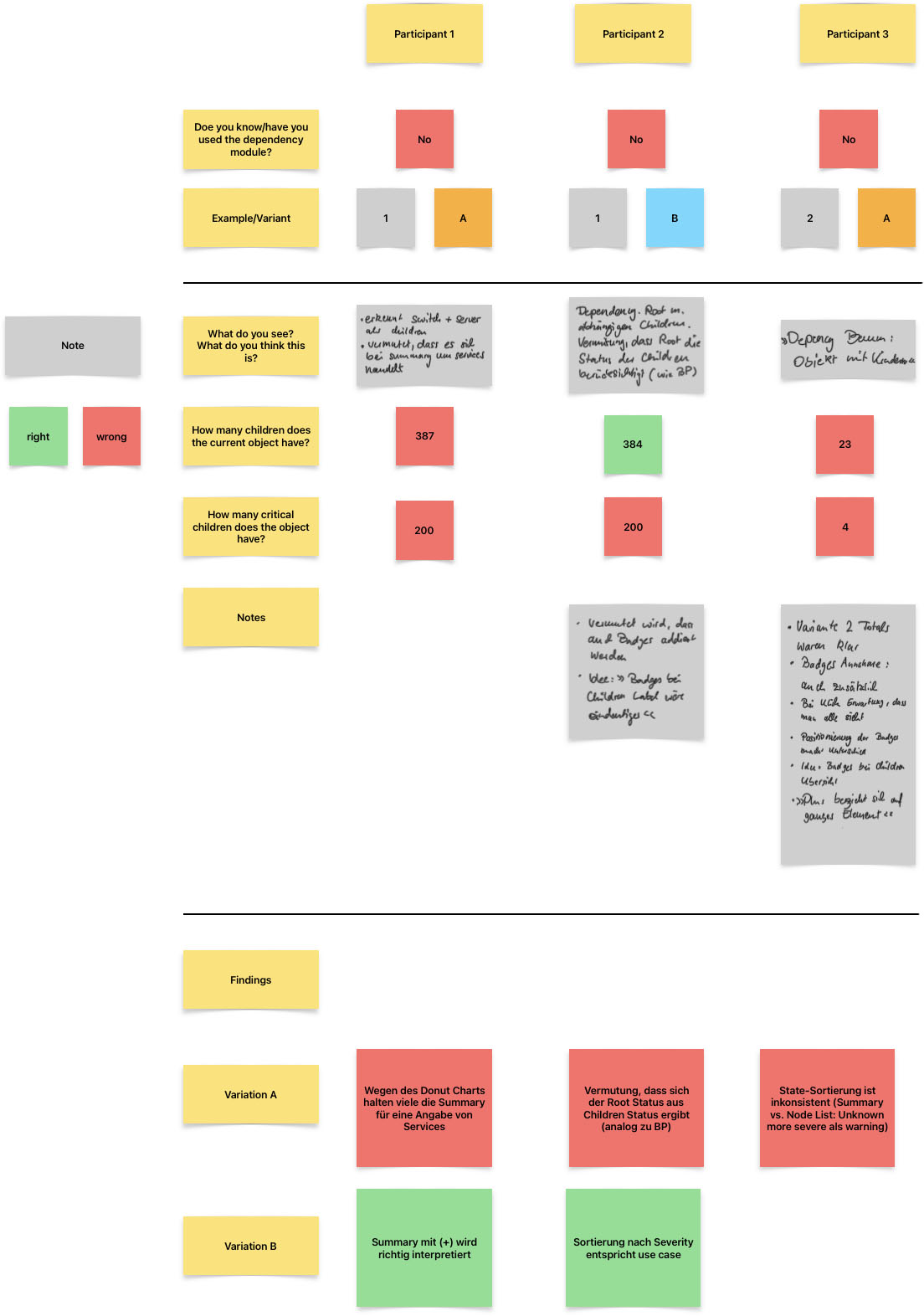
Notes and Findings documentation
Conclusion
This quick test helped us avoid spending development effort on a design that didn’t perform well and gave us confidence in a version users clearly understood.
Nothing is more convincing than seeing someone struggle with – or immediately “get” – something you’ve designed.
Usability testing doesn’t always need to be formal or time-consuming. Even small, informal tests can reveal critical insights – especially when you’re too close to the design to see the problems yourself.