Those of you, who’ve already tried out the Web Interface for Icinga DB might have noticed the redesigned layout of the check execution statistics section in a monitoring object’s detail view. For all the others: Learn about it in this post.
On first hand we wanted to make the informations more compact and put them in relation with each other, where possible. We aimed to keep all the information of the old one, though.
And since the old version was just a table of keys and values, it wasn’t hard to come up with something more creative. We wanted it to be more accessible for new Icinga users but keep the clear character and the information for long time Icinga Web users.
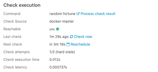
The original check statistics table display
After trying different layouts, a card design made most sense for us. We put most of the pure meta data in a header area, but eliminated fields for space efficiency, like e.g. for reachability and merged them into the »Check source« field. We also make use of the check attempt dots, for better graspability at smaller check attempt numbers.
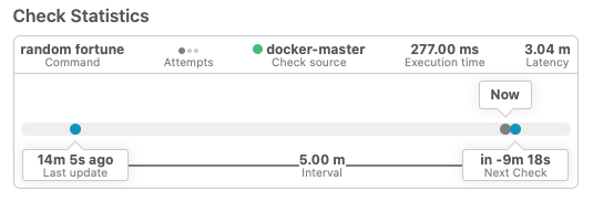
Redesigned »Check Statistics« card widget
The main part is the new timeline area, though. It sums up all of the time related data and puts them into context with each other. You can see the »Now« spot moving between the »last update« and »next scheduled check«. Overdue checks will also get easily spottable, since the now pin will be placed outside of the interval timespan.
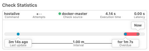
»Check Statistics« card of an overdue item
We’d be glad to hear, what you think about the new Check Statistics layout. Tell us what you like about it.

