
When the news appeared that there would be a new Variables feature released for Figma, it immediately seemed huge to me. I’ve just started building the Icinga Web Design System in Figma. One of the biggest struggles was to deal with our light/dark theme modes.
I solved it with creating separate color styles for each mode, but this way one still had to create a separate component variant by hand and apply the respective colours to it.
At first sight variables seem to make this a lot easier. Once set up, it also seems to solve this issue automatically. No more separate component variants for each mode, halving the effort for every component.
Variables is currently in open Beta. I’m not expecting it to work perfectly, but it also seems promising to get even more advanced features.
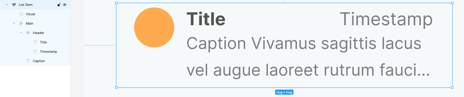
Set Up a List Item
At first we are going to create a new Figma Document and a Frame. Within that Frame we set up a generic list item with the following element:
- Visual
- Header Group with Title Text and a Timestamp
- and a two lined caption
We ignore the auto layout settings because it won’t matter in this example.
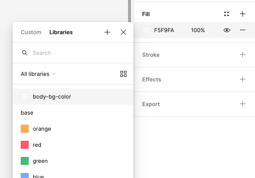
Create the color variables
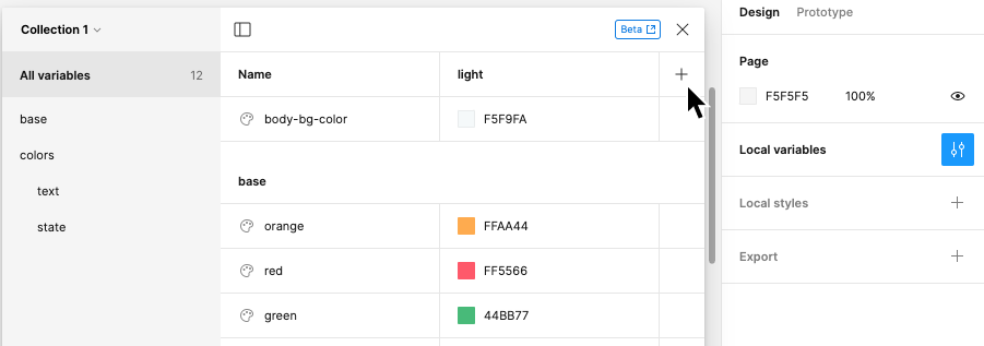
To access the new variables feature you have to click outside the current frame, so that no object is selected.
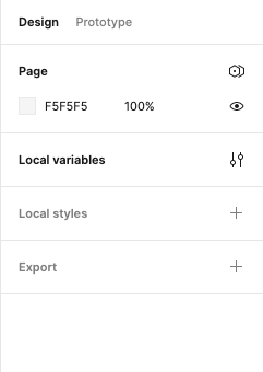
In the right sidebar with the Design tab there’s now a new section called Local variables. To reveal the variables we click on the this section and the variable modal pops up.
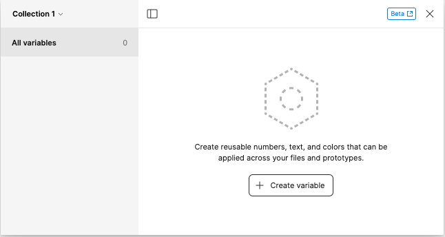
It’s empty at first so we add our first variable by click “Create variable”. Since we want to set up the light and dark mode our first variable will be of type Color.
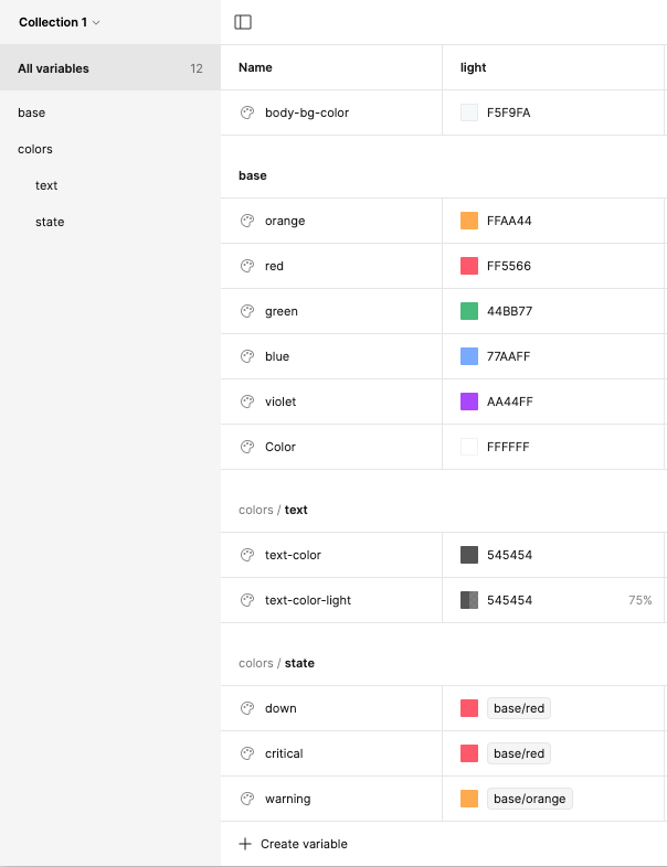
We add the variables we need. It’s possible to group them by separating the levels with a /, e.g. color/text/text-color. It’s also a good practice to set base variables and reuse them in a semantic way.
For instance, I set a variable base/orange as a base variable and then used this color in another one called colors/state/warning. Figma is so kind to display the variables hierarchically.
Use the variables in our component
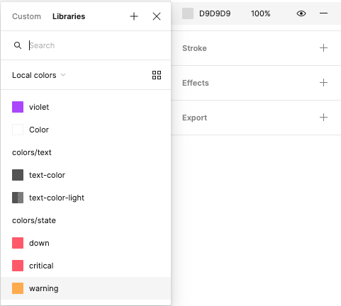
Next we want to make use of the variables we just set. Therefore we select our visual state element, click on the fill color to change it and select our colors/state/warning variable. It’s also possible to filter for only local colors in this modal.
We repeat that process and select colors/text/text-color for the title and “text-color-light” for the timestamp and caption.
Add dark mode variables
After setting up our component with variables we now want to add the according dark mode colors. So we deselect everything by clicking outside our frame and navigate back to the variable modal.
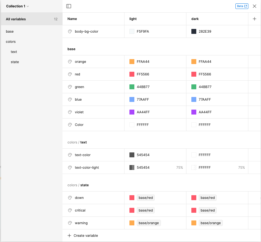
We then click on the + icon to add another variable mode.
The result is another column per variable. At first we rename the variable modes to light and dark for the theme modes. You can do that by right clicking on the table headers and select Rename mode.
Now we can change all the variables needed for dark mode.
Set up test frames
Nothing else is to be done, to have the dark mode colors applied. We can now test the result.
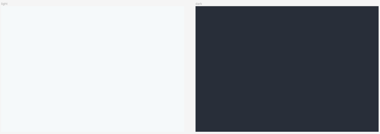
So at first we create another frame to test our dark mode setup. After that we select that frame and set the background fill. Obviously we select body-bg-color.
After that we can duplicate this frame. You can do that by hitting Cmd + D What we want to do is to have one frame for light mode and another one for dark mode.
After that we select the second frame. What we find now next to the Layer section title in the right sidebar is a new icon. We click on the icon and a new flyout will be revealed with the selection of the variable mode.
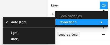
Since we want to have our second frame reflect dark mode, we select the respective option. We recognise that the background color of the second frame immediately changes.
Test theme modes being applied to components
We add a copy of our list item component to our light mode frame and duplicate them multiple times to create an item list.
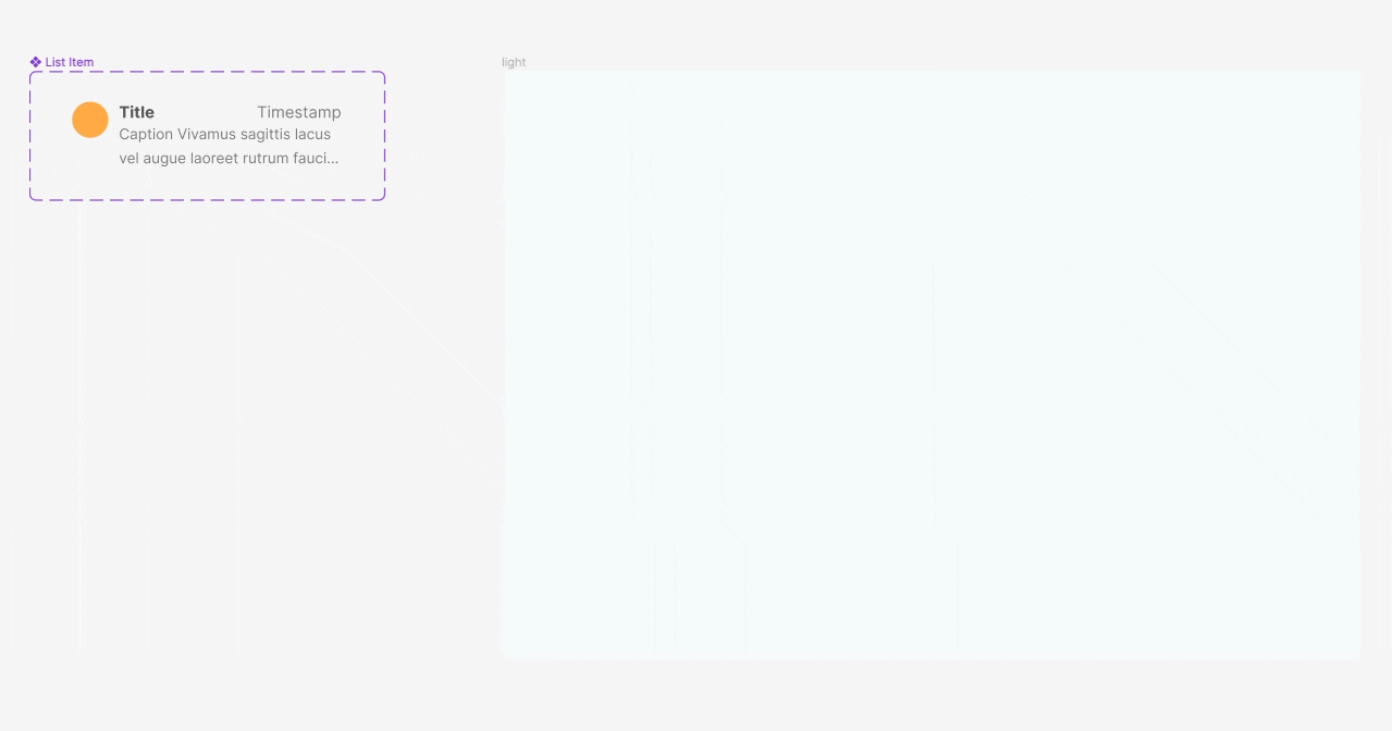
Now follows the interesting part, where we can see if our set up works. We select our list and drag it to the frame with the dark mode setting.
While dragging the list we can immediately see, that the colors for the list items change accordingly. 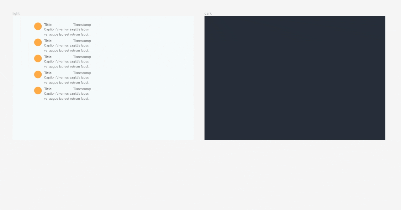
Final thoughts
So, this is how theme modes work with variables. The new feature makes it a lot easier to handle different color modes. There should of course be a lot more examples where variables can be helpful.
Using variables with prototyping looks especially powerful and since the feature is only in beta at the time of writing this article it already offers a lot and seems to work very stable.
What I was missing in the first place was to change the theme mode with prototyping actions, though, but I’m optimistic that there will be a solution for that in the near future.