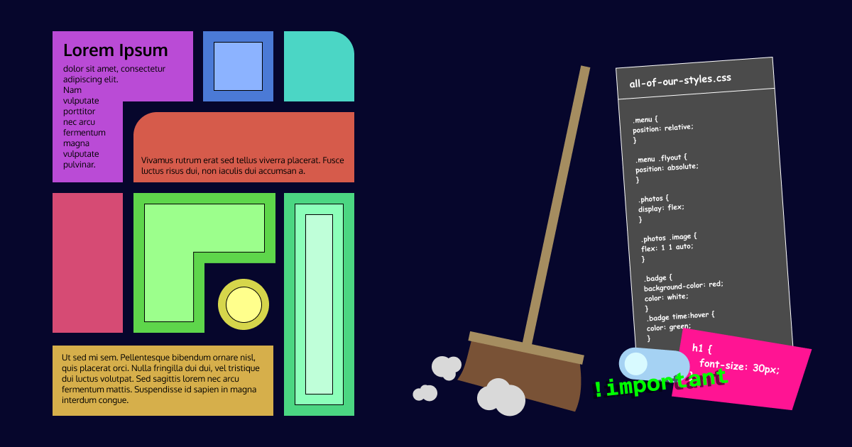
Ever looked at some CSS and your first instinct was to close the editor and never look at it again? I did. Though, I don’t have the luxury to close the editor in such a case, as is probably often the case for others as well. Code grows with time and so do bad practices, as well as contributors. And the latter means, someone works on it someday again but didn’t contribute prior.
Programmers in various languages know very well, that code isn’t that often written as it is read. Hence some clever people thought of design principles, patterns, guidelines, etc. And to me, the same applies to CSS, or should.
Use Multiple Files
Take OOP (Object Oriented Programming) for example. We, at Icinga, define our widgets by plain PHP. Every one is represented by a class. The layout and style rules for each widget are also defined in separate files which are named after their corresponding PHP class. If there’s a base class involved and it defines parts of the widget(s) in question, it also has its own file for style and layout rules.
This way, it is easy to look up the corresponding stylesheet for a widget and all related style and layout rules are in a single place.
It is still beneficial that the browser has to download a single stylesheet only. Though, with the advent of CSS preprocessors it should be well established by now, that the stylesheet is spread over multiple files on the source level.
Use Specificity to Your Advantage
Any web developer deals with CSS Specificity and fights against it at some point. It’s also one of the main reasons to me, why CSS gets untidy. But there’s a simple way to reduce the complexity of rules and in turn also their specificity.
I’ve already mentioned style and layout rules. Most of the time, problems with specificity arise when applying a different theme, such as a corporate branding. But when does a theme require changes to the layout? I mean, sure, there are probably some. But in my opinion, this is an edge case, and not very common. (Exclusively talking about software like Icinga Web) Changing the background, link color or logo should be as easy as this:
a {
  color: lime;
}

body {
  background-color: black;
}

.site-logo {
  background-image: url(img/acme.png);
}
Layout on the other hand, can’t avoid high specificity most of the time, hence why rules like this are fine:
.sidebar > .level-1-entry {
  position: relative;
  width: 8em;
  height: 2em;
}

.sidebar > .level-1-entry > ul {
  position: absolute;
  top: 0;
  left: 8em;
}

.sidebar > .level-1-entry > ul > .level-2-entry {
  width: 12em;
  min-height: 2em;
}
Just think about what anyone wanting to adjust the sidebar’s font color for primary entries and secondary entries needs to define. If it’s straightforward and easy like below, it’s fine:
.sidebar .level-1-entry {
  color: red;
}

.sidebar .level-2-entry {
  color: orange;
}
This can of course also be solved by usage of variables:
:root {
  --sidebar-primary-color: cyan;
  --sidebar-secondary-color: purple;
}

.sidebar .level-1-entry {
  color: var(--sidebar-primary-color);
}

.sidebar .level-2-entry {
  color: var(--sidebar-secondary-color);
}
Cluster Dependent Rules
I’ve already hinted above at what I want to mention now: Always group or cluster related rules together. This is also commonly done when defining PHP classes and their properties as well methods. Some may know this under the term minimal vertical distance. The goal here is to outline rules that depend on each other:
/* Without the parent being relatively positioned, the flyout's point of reference may be something else */
.menu {
  position: relative;
}

.menu .flyout {
  position: absolute;
}

/* An image can only be a flex item if the parent is a flex container */
.photos {
  display: flex;
}

.photos .image {
  flex: 1 1 auto;
}

/* The font color is closely related to the parent's background */
.badge {
  background-color: red;
  color: white;
}

.badge time:hover {
  color: green;
}
With LESS, this is even more obvious:
/* Without the parent being relatively positioned, the flyout's point of reference may be something else */
.menu {
  position: relative;

  .flyout {
    position: absolute;
  }
}

/* An image can only be a flex item if the parent is a flex container */
.photos {
  display: flex;

  .image {
    flex: 1 1 auto;
  }
}

/* The font color is closely related to the parent's background */
.badge {
  background-color: red;
  color: white;

  time:hover {
    color: green;
  }
}
The Holy Grail
Now let’s dive into one of my favorites, the Separation of concerns principle, and apply it to CSS.
“Separation of Concerns (SoC) is a design principle that manages complexity by splitting the software so that each part is responsible for a separate concern, minimizing the overlap of concerns as much as possible.„
Font Size
Let’s start with an easy example. The font-size is used in responsive apps to control the size of the content. This is done by initializing it on one or more main containers to a fixed size in pixels. Any other children of such a container can then also freely adjust the font-size, but only by using relative units such as em. So it’s not the children’s concern to define what its actual size in pixels should be.
The same applies to any other size definition. Be it width, margin or positioning (top, etc), none of them (this list is not exhaustive) should use the px unit as it would affect the site’s responsiveness.
If a site uses font-size properly, widgets shrink and grow but keep their aspect ratio once the window is resized.
Margin and Padding
A classic, for me, is also margin and padding. It should be common to think of margin as the outer or external spacing and of padding as the inner/internal one. If we have a container that’s part of a group, e.g. a photo gallery, each can freely define its padding without affecting its parent or siblings. The margin however, should only be the parent’s concern. The children cannot know whether they’re the first or last. If they are, they have typically no margin-left and no margin-right, respectively.
This may not sound important with the example given, as this is indeed a single widget where such a clear distinction is not strictly necessary. But just think about a view that contains multiple different widgets for a moment. Probably some widgets even, that are also used in other views. Then such a distinction is necessary, as if any widget defines a margin on its outer edge, the view may have to counteract it with it’s own rules targeting the widget:
.view {
  /* Separates each widget in the view */
  > :not(:last-child) {
    margin-bottom: 1em;
  }

  /* There is a widget though, which is last, and applies its own margin-bottom... */
  > .mis-behaving-widget:last-child {
    margin-bottom: 0;
  }
}
This is not just applicable to margin and padding. Also to flex-gap, grid-gap or border-width.
Once this is done properly, CSS should be much cleaner as it contains less instructions to counteract rules. Browser performance should also slightly benefit.
Colors
Colors are also very easy to mess up. Especially if you use variables. There are background colors (background-color) and foreground colors (color). They are typically used in conjunction to establish a good contrast ratio.
Problems arise if you define colors too often. Whether that’s by properties:
ul {
  background-color: grey;

  li {
    .title {
      color: white;
    }

    .description {
      color: white;
    }
  }
}
Or by variables:
:root {
  --list-background: grey;
  --title-color: white;
  --description-color: white;
}
The issue here is that the inheritance is not used, which makes changing the foreground color for themes and such more challenging. Consider this enhanced example: (now both combined)
:root {
  --list-background: grey;
  --list-color: white;
}

ul {
  background-color: var(--list-background);
  color: var(--list-color);
}
It’s not the list item’s concern to define their foreground color, it’s the list’s as it defines the background color. Inheritance will ensure the children get the correct foreground color.
Conclusion
CSS can be as pretty as real programming languages. But there’s not just the subjective aspect, it may also enhance the convenience to work with it as it’s cleaner and tidier. It also increases the browser’s performance, the less (competing) instructions to process, the faster the render time.
But I know that it’s sometimes much to expect. It isn’t for everyone nor every website. It demands time and consideration, which might not be justified for small projects. But even if I convinced you to apply some of my suggestions, I’d be happy!
Though, one thing I hope gets extinct everywhere…
The Elephant in the Room

If you use it, you’re lazy. If you can’t avoid it, you can count the reasons on one hand and you remember them years after, as it’s been always a rare occurrence. Or you administer solely a CMS, in which case you can blame the theme and extension authors. Or better yet, show them this article!


