
As you may have noticed in one of my last posts, I’m not super averse to using Sketch in my daily workflow. Still, for creating UI mock ups, both high low quality, Sketch is the graphics tool, that I feel most comfortable in, because it enables me to work and ideate really quickly. It has well thought out keyboard navigation and shortcuts by default. Having them internalized makes it really easy to bring to “paper” what’s in your head.
In this post, I want to give a quick overview about Sketch Symbols and how I use them for Icinga Web 2. They come in really handy, when working on one product and enables you to get quick results.
Using default artboard sizes make life easier
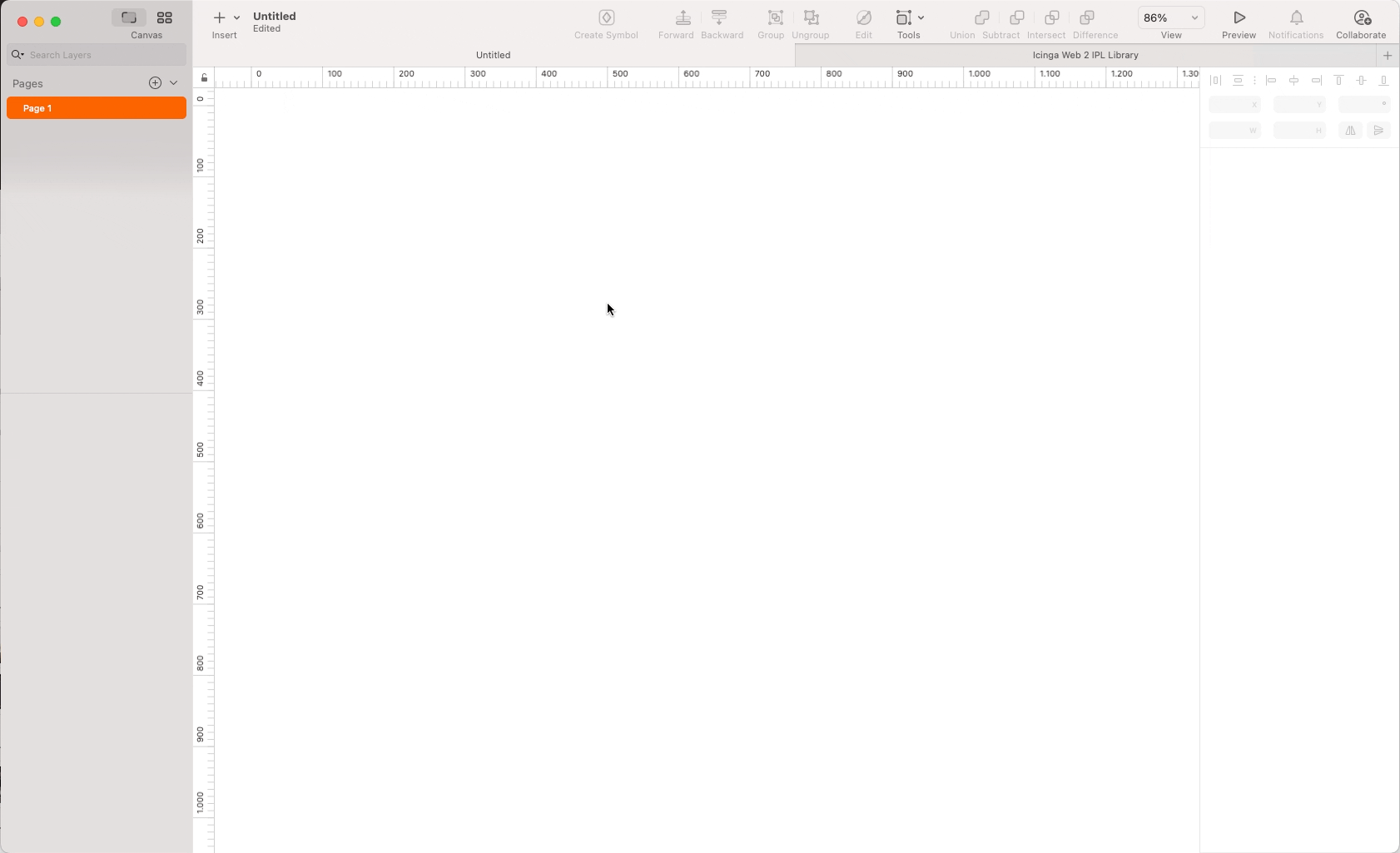
At first I want to send ahead, that I use few default artboard sizes for all of my projects, because it makes the workflow so much easier. By doing this I avoid having to nudge single symbol pixel and risk breaking them (the autolayout feature is nice but doesn’t always work perfect.
For Icinga Web my main Artboard size is 1280px by 1024px or taller, when necessary. Since we focus more on desktop usage, it wouldn’t make sense to start with a mobile screen size. My default size for the latter would be 375px by 667px. The exact numbers don’t matter, just be sure to get good average values of the standard values for the respective medium.

I pretty much get along with these two Artboard sizes.
Library Setup
Over the years I’ve built a pretty extensive Library of Icinga Web 2 UI components, which is mostly contains the standard UI elements for Icinga Web 2. I went for pragmatism and quick usability when creating this and changed the structure from time to time, to make it as easy as possible to change components.
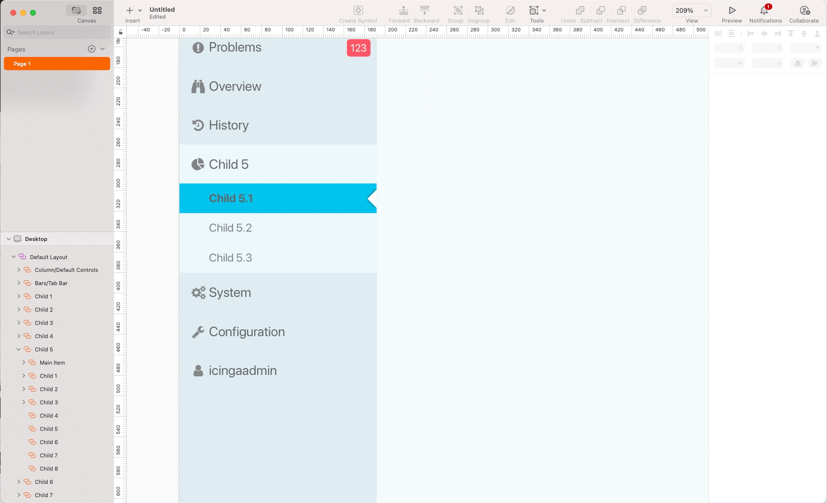
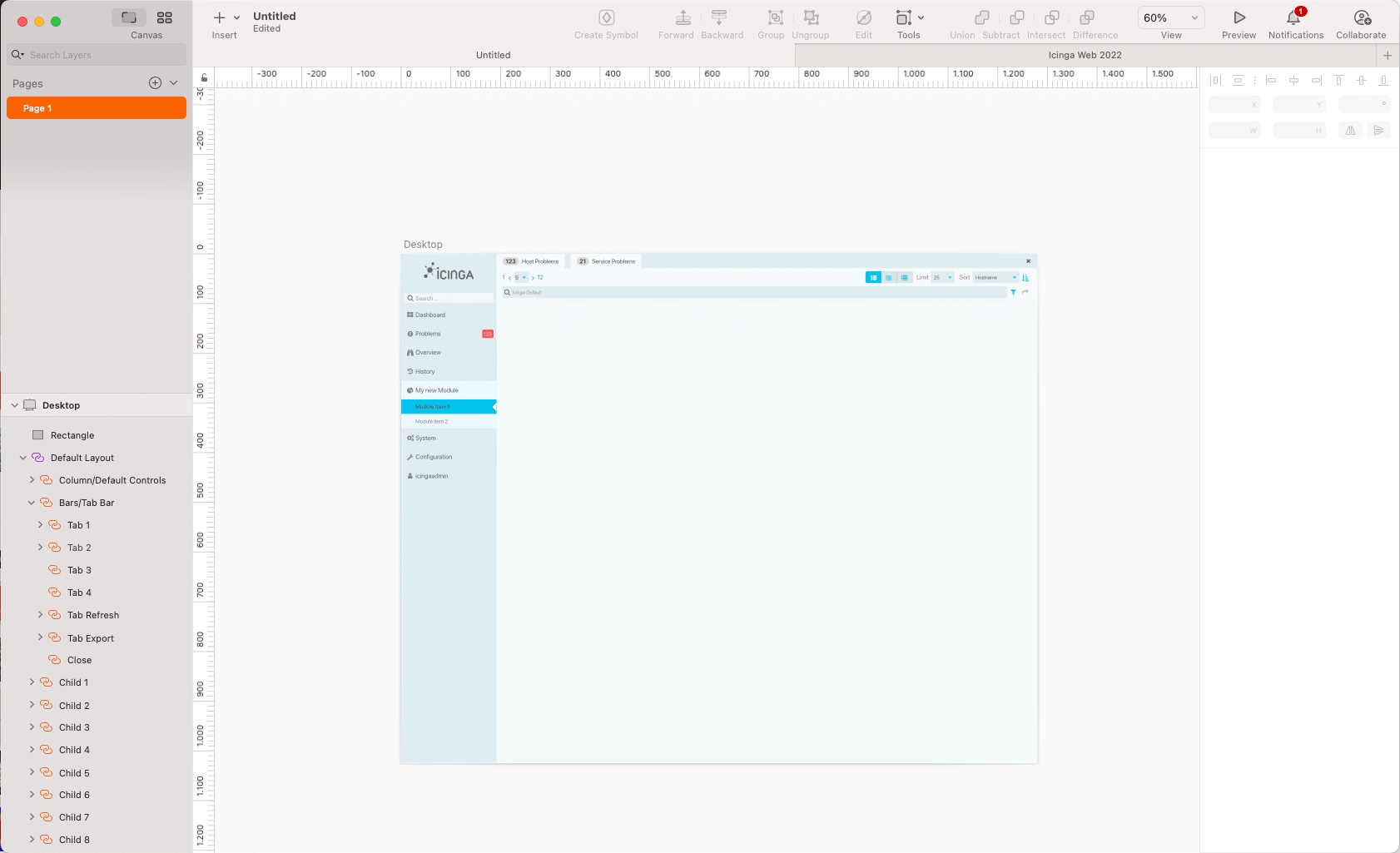
In case of a new project. I create a new artboard and begin with the default UI frame, which is already a pretty solid starting point.
The next step is usually to customize the sidebar navigation to highlight the item for the active view.
Setting up the viewport
After that I’m usually pretty much setup up for creating the UI in the viewport. If necessary, I can also choose if my view would have a control bar, either the default one for list views or a customized one, or do something completely different. This is all setup in the symbols I’ve created. It works almost the same as in the sidebar navigation.
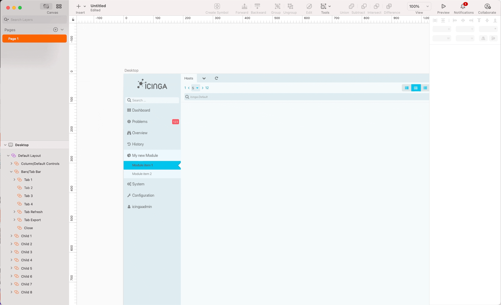
After the basic elements are customized, I can start populating the viewport. In my example I choose to have a host list in the viewport. So I navigate to my symbol selection window and search for “list item” (Notice, that the library is not the tidiest). I choose the one I need, in this example “Host List Item” and insert it.
I can then duplicate the list items as I need. To make the content seem more realistic, I use the data feature to populate the preset symbol fields. I’ll consider to make a separate post on how to use data fields in Sketch.
I hope that gives some insight, on how I use my customary created Icinga Web 2 UI Library, when making user interface mock ups. Of course a lot of time and effort went into setting up the library. But in my opinion it’s really worth it. Working with mock ups is mostly about visualizing ideas and that’s why having everything at hand is crucial especially in an ideation context.